May 31, 2019 / Reskin
Day 7 Photography Reskin
May 31, 2019 / Reskin
Day 7 Photography Reskin
Background
Engaged couples are notorious for intense and comprehensive market research, so having the information displayed well on the website is crucial. With hundreds of photographers in any given city, it’s no wonder a bride or groom can take just 15 seconds to decide if you are their style or not.
For many years, I saw my website as simply a storage place for my images. I treated it as a gallery to display images, and I did not think about the user’s needs as they are researching dozens of portfolios a day. With heavy reliance on personal connections and referrals, I was able to sustain a thriving business with 20+ weddings a year.
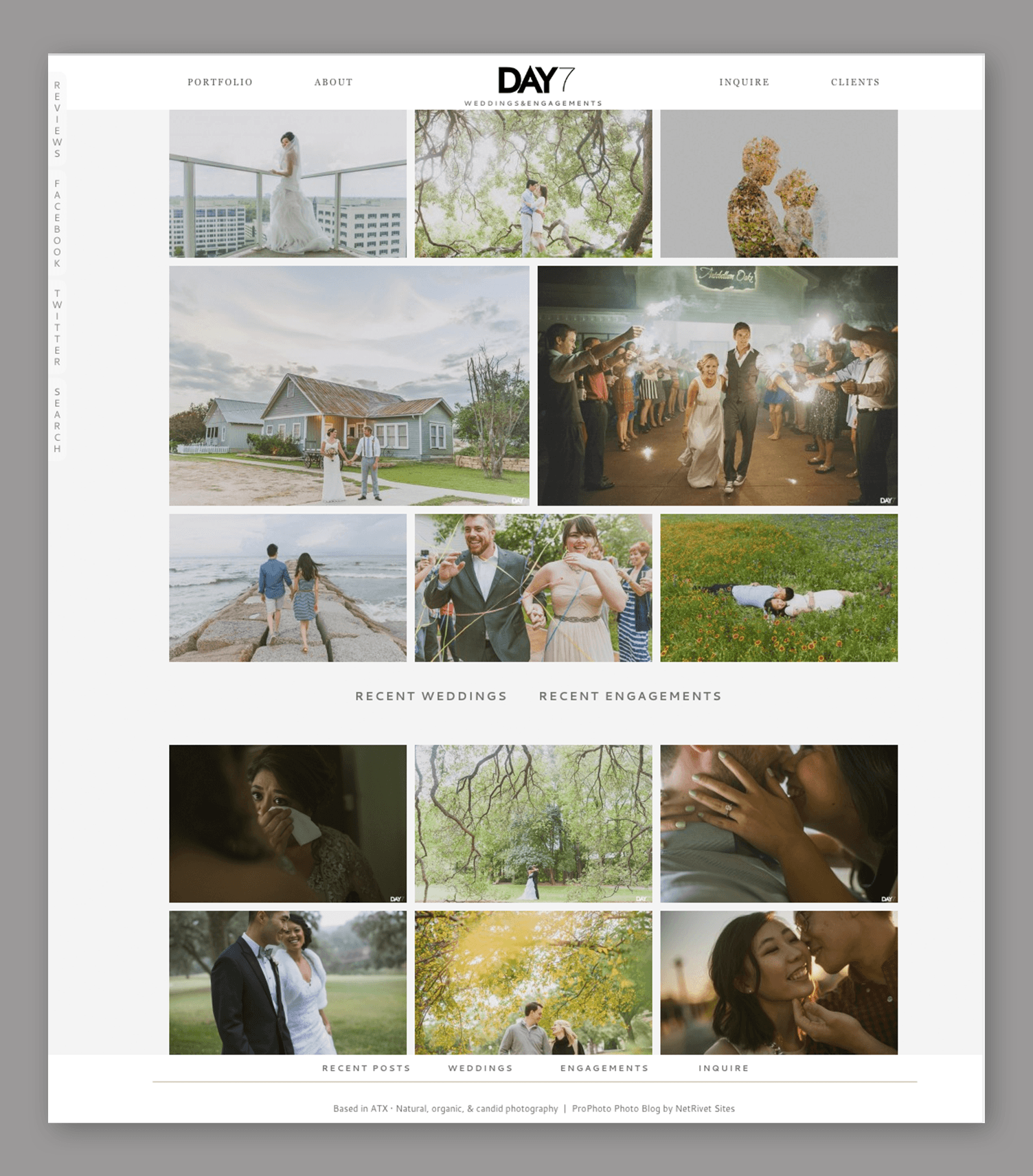
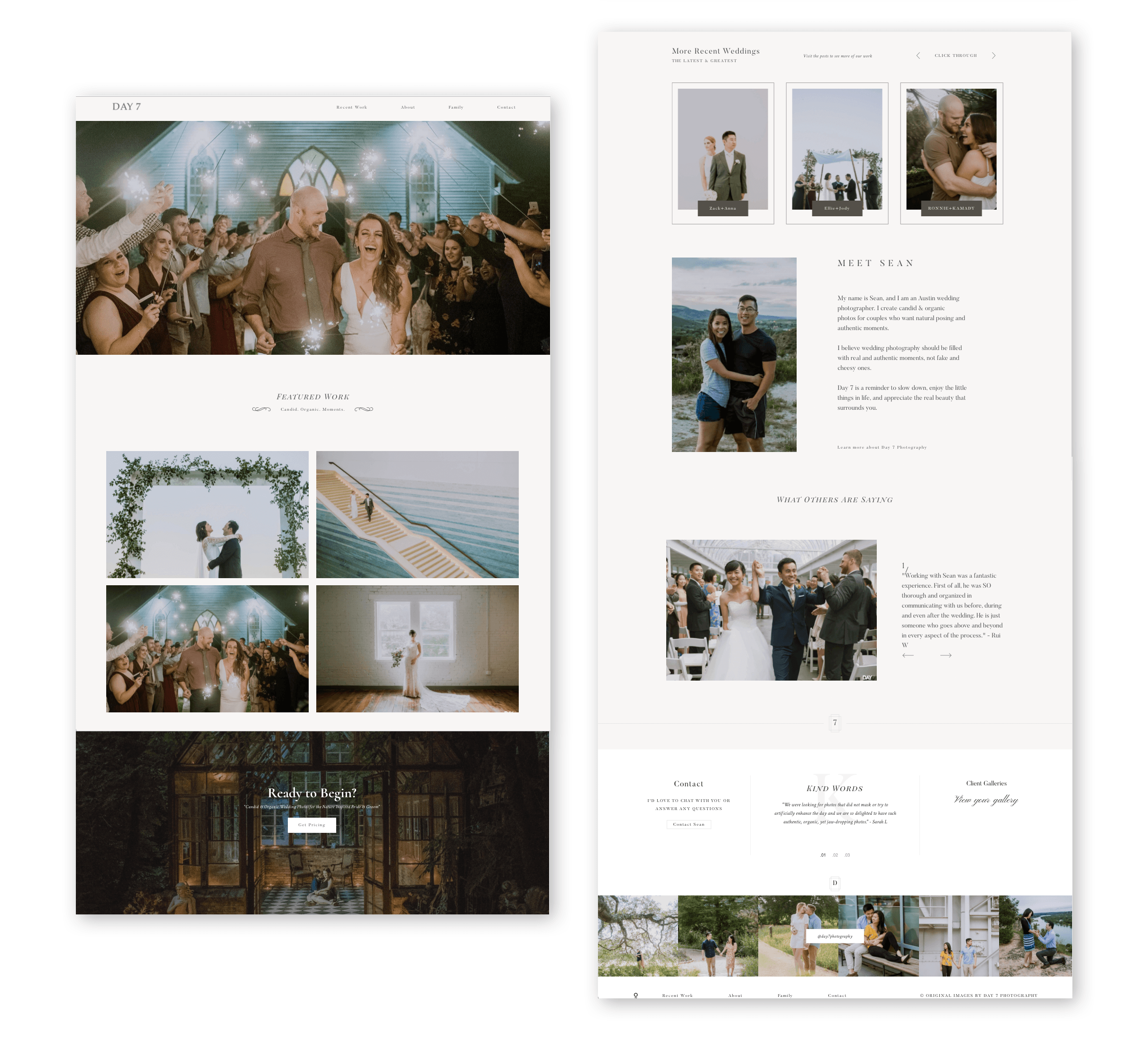
Before:
Defining the problem
In 2016, I noticed a shift in the way people interacted with websites. Social media platforms like Instagram were growing in popularity, and my website traffic was steadily declining. On top of that, Facebook algorithms were making it harder to get organic Facebook traffic without paying to advertise.
By talking with other industry professionals, I was able to gain an understanding of the shifting trends in the industry. It was through my personal conversations that I realized the underlying problems of my website:
1. Strong Imagery is not enough anymore
I was focused on letting my images do the talking, to the point that I had no text, stories, personality, or buttons to grab the users attention. I was putting my favorite work front and center, but I saw through Google analytics that users were not clicking on these links.
2. Lack of personal connection
Not only were users looking for great photos and unique style, they were looking for personal connection with the photographer. Instead of putting only my featured work on the top fold of my website, I needed to show my personality.
3. Lack of search optimization
Since my personal network was beginning to move past the marriage stage, I knew that would eventually mean less referrals. I needed to make my website more searchable for Google so that I could reach new audiences. At this stage, my website was also failing on page speed tests.
Synthesis
My discoveries through conversations with industry peers helped me see that I needed to re-think my website.
My website lacked human connection.
Research
Job stories
I realized I had been designing my website for photographers, but not for my target users. I needed to think about what my target users were using my website for, so I used the Jobs to be Done framework to put myself in their shoes:
User #1
When I am looking for a wedding photographer
I want to look at their work
So I can find a good personality and style match.
User #2
When I am looking for a wedding photographer
I want to find their pricing
So I can see if they are in my budget
Based off these two job stories, I would redesign my website with these users in mind.
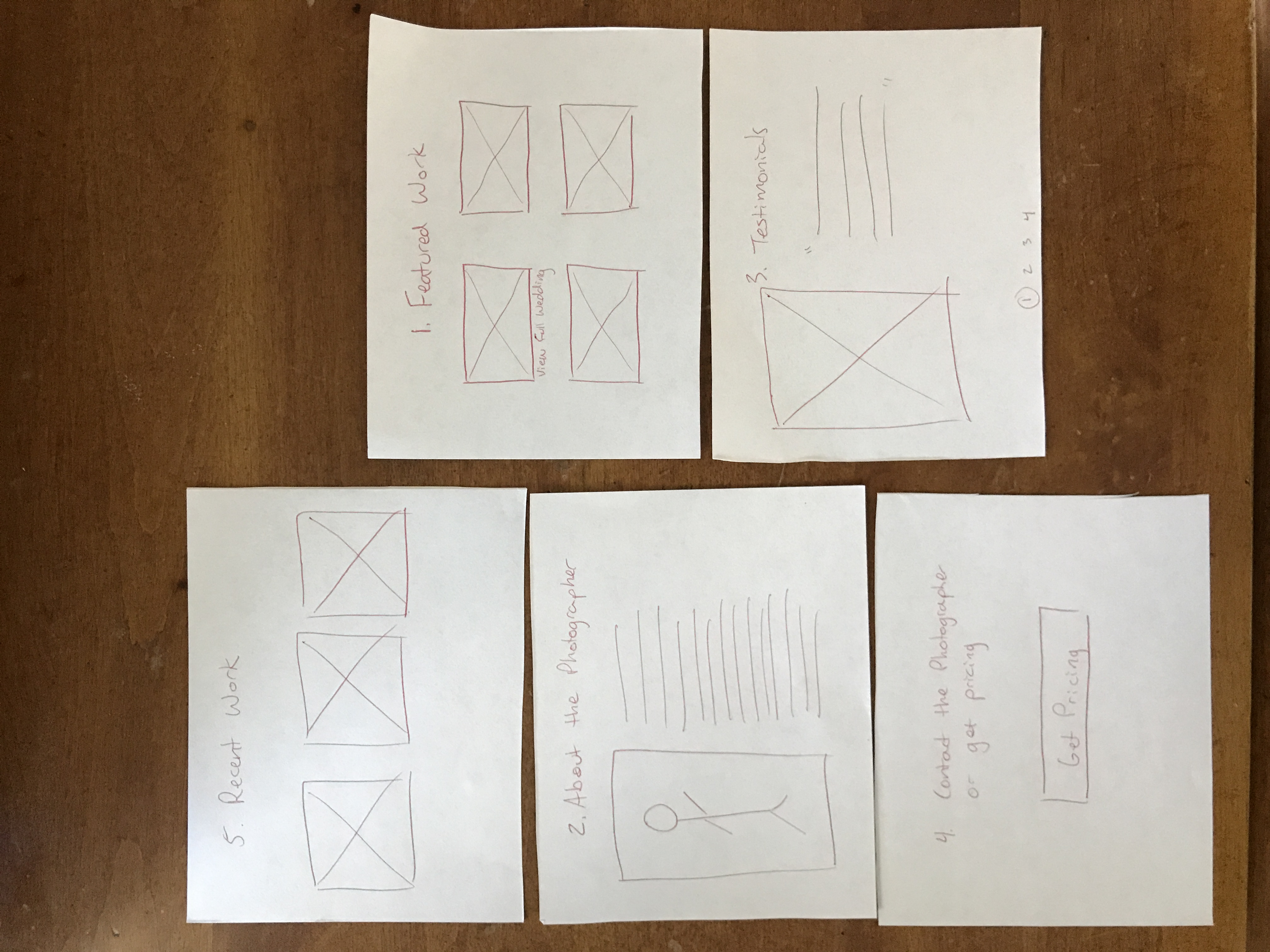
Ideation
Wireframes
I started by sketching some layouts that were modular so I could move sections around:
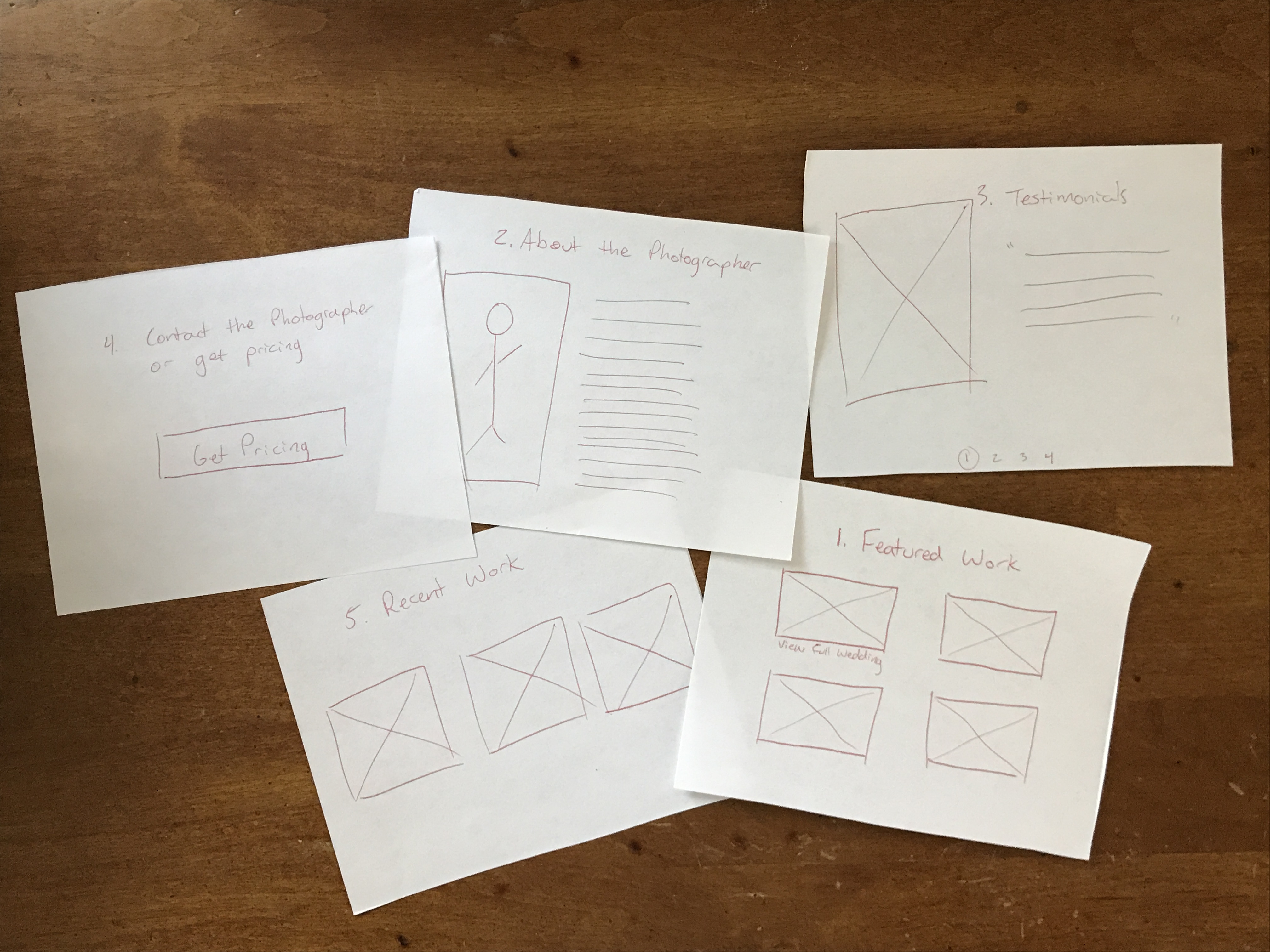
Using my job stories, I decided to arrange my website in the following order: 1) Featured work 2) About me, and 3) Pricing.
Design
Iterations
Surveys + Interviews
To test my design, I wanted to ask users what they cared about most on a website to confirm what I had designed. I asked past clients and target users to rank the order of importance on my website:
1. Links to featured work
2. About the photographer
3. Testimonials from past clients
4. Get pricing
5. All recent work
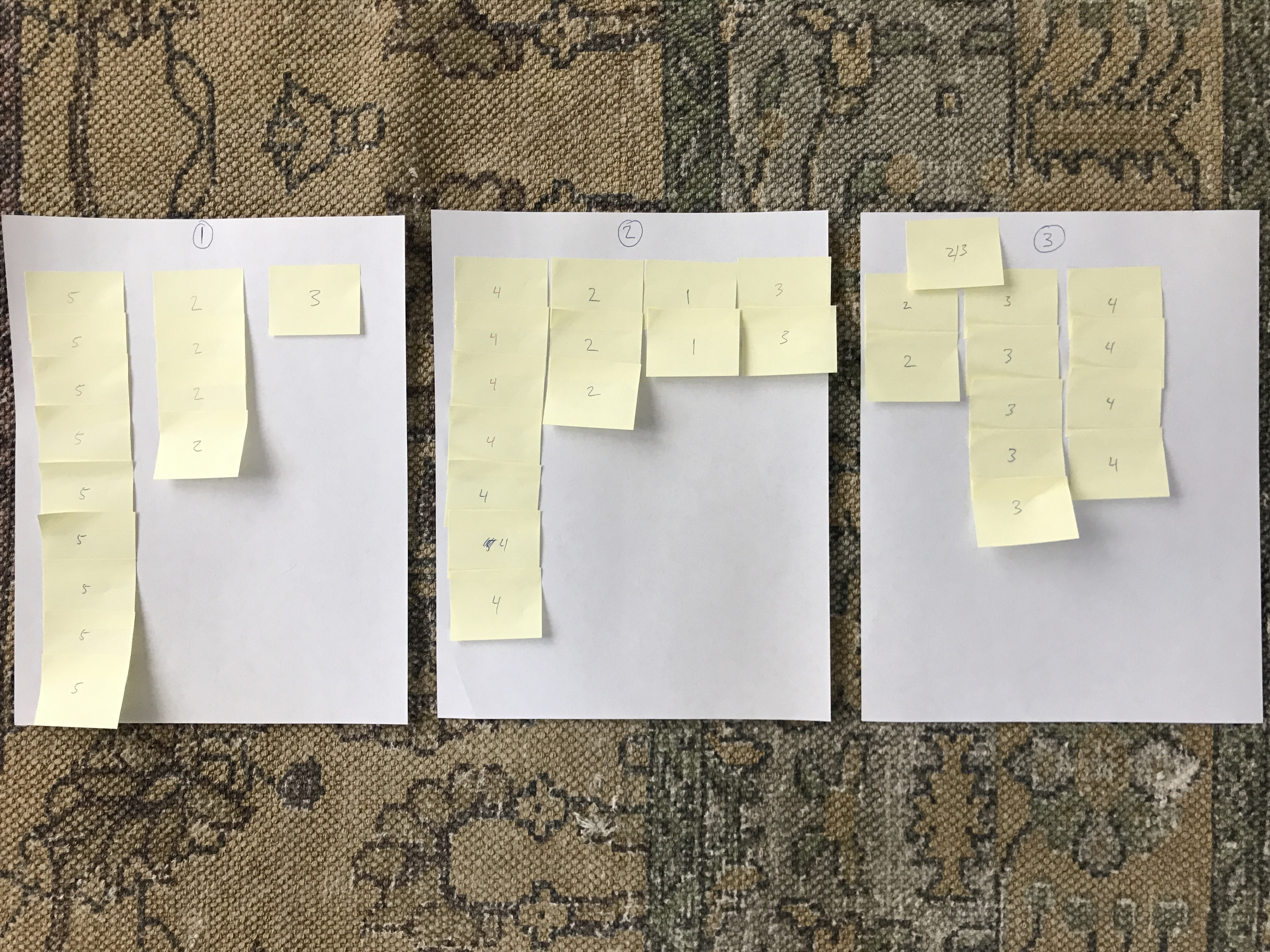
I then tallied the first-priority, second-priority, and third-priority suggestions all onto their own pages. Through these results, I could see that users clearly want to see all recent work and pricing as the top two areas on the website.
Some users explained their reasoning behind their choices:
“I would personally rather see recent work over featured so that there’s no bias from the photographer choosing their work to display.”
When reading reviews, one user said: “I prefer sourcing from the Knot or Wedding Wire, so they don’t feel as curated from the photographer,” and, “If they have instagram, I want to see their work there too.”
By recording my survey answers, I discovered that users:
-
-
- Prefer Recent work > Featured work
- Prefer 3rd party sources for reviews like Yelp, WeddingWire, or Knot > curated reviews
- Want to see Instagram as part of the body of work
-
I also revised my Job Stories based off these new discoveries:
User #1
When I am looking for a wedding photographer
I want to look at their Recent work
So I can find a good personality and style match.
User #2
When I am looking for a wedding photographer
I want to look at their Instagram
So I can see their recent work and style.
I needed to make it easier for users to find my recent work and my pricing, so I would need to change the order of my content.
Redesign:

Changes made include: 1) Including a button to Recent Work on the hero image, 2) Moving my bio section to the top fold, 3) moving the Instagram feed to the 3rd section, and 4) making the last section the call to action.
SEO Optimizing and Tracking
I spent several weeks optimizing my content for SEO and page speed improvements. My tasks included:
– Add alt-text image descriptions on over 10,000 images
– Re-write 282 blog posts centered around a focus keyword for search optimization
– Optimize images for faster load times
Validation
To see if this redesign was successful for search optimization, I tracked my Google analytics over a 6 month period to see if users were finding my website organically.
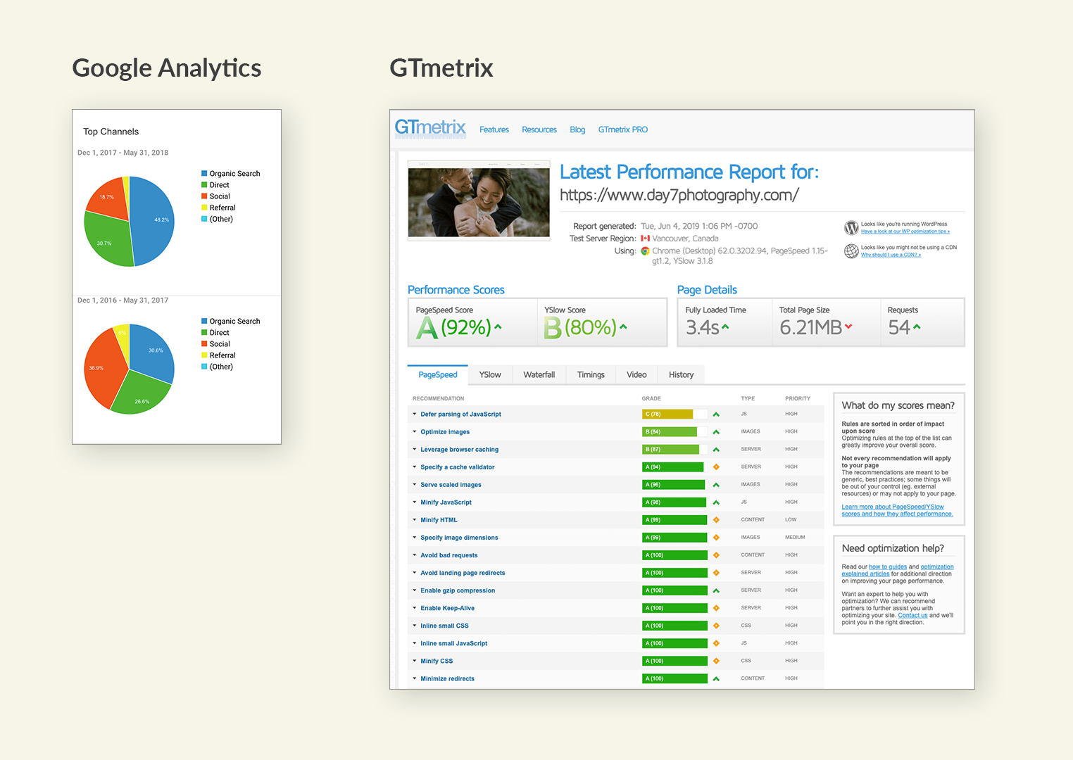
Organic search traffic to my website increased by 18% from the year before.
I also increased my PageSpeed Score from failing to 92%.
Implementation
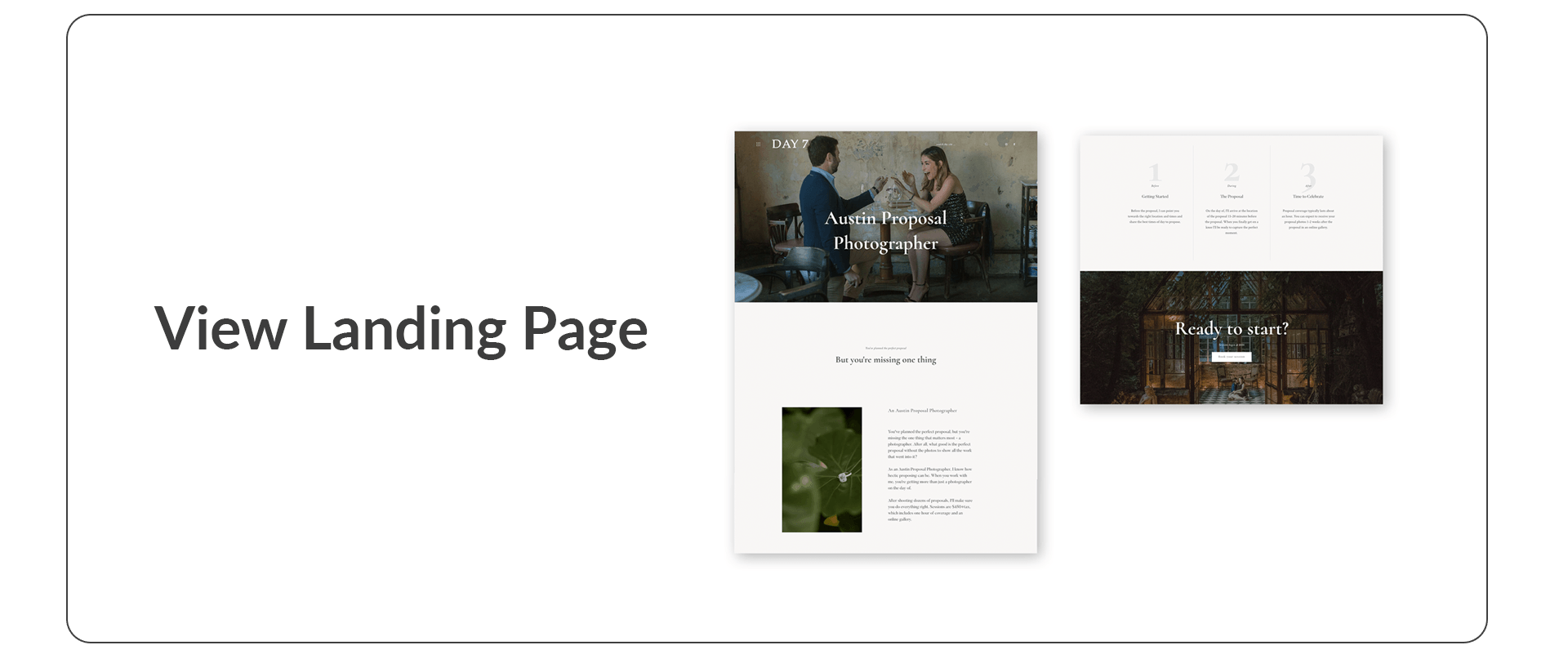
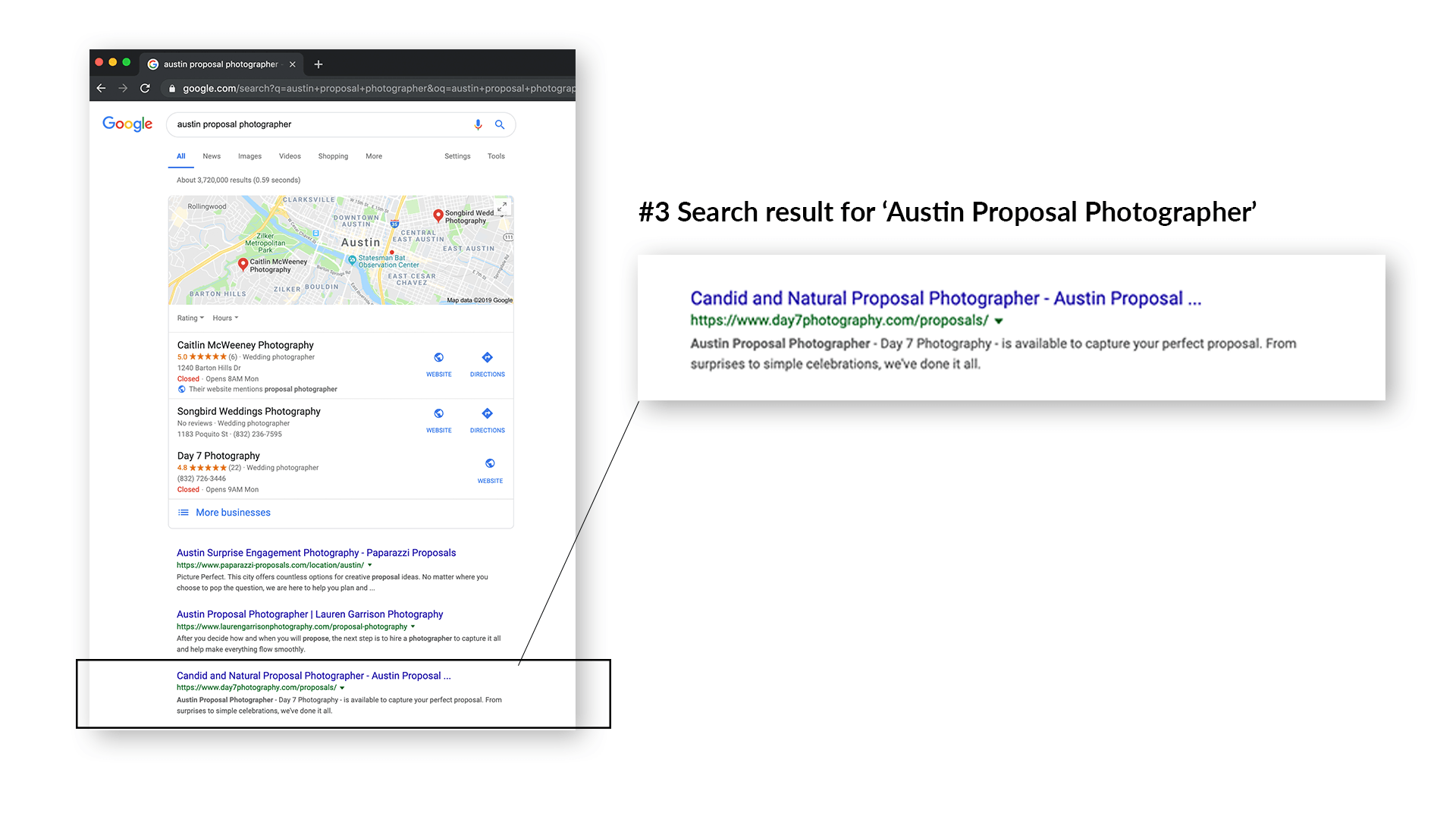
Because of the success of this redesign, I moved onto other areas of website to see where I could apply user-centered design. Since “Austin Proposal Photographer” was a popular search term, I creating a landing page targeting this keyword phrase.
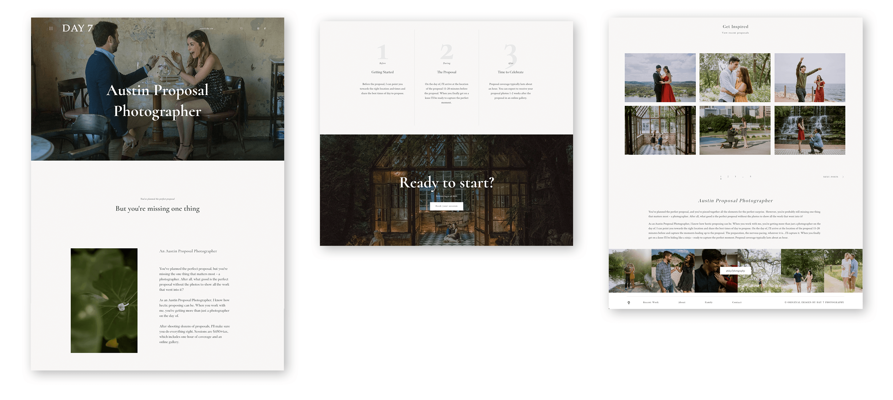
After implementing this new landing page, my search ranking jumped from the second page to #3 in search results. This redesign also resulted in a 22% click through rate for the keyword “Austin Proposal Photographer.”
Conclusion
By listening to user feedback, I was able to re-design my website for a more intuitive flow. With user-centered design, I focused my website content towards what the users are looking for. Lastly, through comprehensive keyword optimization, I was able to reach new audiences through Google.
The website is now more than just a place to store images, but instead a friendly and inviting storefront in a stressful marketplace. With hundreds of photographers in the Austin area, I believe these changes gives my website a strong competitive advantage.