Comptrollers Sales Tax redesign
Comptrollers Sales Tax redesign
This project features a re-design of the Texas comptrollers sales tax website through simplified user flow, re-organizing the information architecture, and improved visual hierarchy. View the InVision prototype here.
Background
Becoming a first-time business owner can be empowering and exhilarating, it also means paying taxes and dealing with the local government. There are permits, registrations, and various forms to fill out as a small business, but the worst of all is the poor online experience of paying your sales tax.
This monthly task involves inputting your total sales online, and then paying the 8.25% tax to the state government.
Defining the problem
Small businesses have a lot to worry about, but paying sales tax shouldn’t be part of it. Currently, the process to pay sales tax is overly complicated. There are 10 pages to click through in order to complete this process:
Current user flow
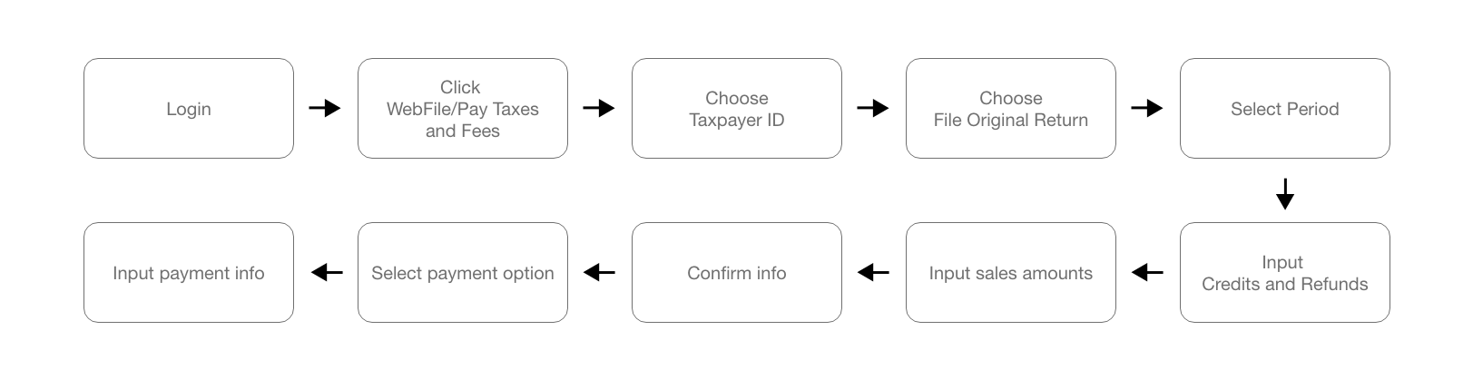
Click here to view the current user flow in a PDF.
Initial User Testing + Interviews
To ensure I wasn’t the only one experiencing problems with the website, I tested 6 users by recording their process asking them questions about their experience. Since paying sales tax is my most often used task of the site, I tested users on their ability to complete this job.
To guide my testing process, I asked users to complete the following tasks and asked the following questions:
-
- You are a business owner who wants to pay sales tax. What do you click first?
- After you’ve clicked the correct link to pay sales tax, what do you click next?
- How did you feel as you were going through this process?
- What would you rate the overall experience of this process?
Not surprisingly, the results of the initial user testing confirmed my own frustrations of the task flow:
-
-
- 1 out of 6 of users successfully found where to “pay sales tax” on their first try. 5 out of 6 users landed on the wrong page at least once before finally arriving on the correct link.
- After landing in the correct spot to pay sales tax, 0 out of 6 users succeeded to click on the right link to proceed within the task.
- The average rating of the overall experience and ease of use was rated a 3 out of 10.
-
After clicking the wrong link for the 3rd time, one user said:
“I want to give up”
4 out of 6 users said they felt overwhelmed throughout the process.
Synthesis
Not only was it difficult to find the correct link to pay sales tax, it was difficult to complete once they started the task.
To summarize these problem areas into one sentence,
Important tasks are hard to find and complete because of too many options.
Pain Points
After further analyzing the current user flow of paying sales tax, I reduced the problems of the website into 8 areas:
|
# |
Problem Description |
Solution |
|
1 |
Too many links. throughout the user flow, there are an overwhelming amount of links to click. |
Re-organize the IA for less links. Utilize a menu with most important categories. |
|
2 |
No clear direction of tasks. Lack of visual hierarchy to indicate importance of links/tasks. Without a clear direction, the user is forced to guess and trial/error throughout the site. |
Add clear CTA for key tasks. Use color and styling to indicate a prioritized buttons and actions. Re-organize layout of page to indicate priority of tasks and links. |
|
3 |
Repetitive links and text. Multiple sections in the same page will have repetitive text and descriptions. |
Remove repetitive links and text. |
|
4 |
Lots of wasted and missused space. Poor layout with too many features makes the user experience frustrating. |
Re-organize the layout of the web page. |
|
5 |
Difficult for new users. new users are forced to guess and make mistakes as they fumble through the website. |
Use language that is friendly for new users. Provide help options and make “contact us” easier to find. |
|
6 |
Unclear verbage and writing. Simple tasks like “pay sales tax” should be easy to find. Instead, they use the phrase “webfile” to indicate paying sales tax online. |
Add copy that easily connects with the user, and replace confusing words like “WebFile.” |
|
7 |
Hard to find important information like transaction history. |
Make transaction history visible on home screen after logging in. |
|
8 |
Too many clicks to find simple information. |
Make information like tax ID present on all pages and easy to find. |
Research
Because there are so many functions of a government website, I wanted to focus in on the most important jobs of the website. Using the Jobs to the Done framework, I created two job stories to narrow down the main goals:
When it becomes the 1st of the month
I want to pay my sales tax
So that I don’t have to pay late fees
When I lose track of whether or not I’ve paid my sales tax
I want to check my transaction history
So that I can make my payment on time
Ideation
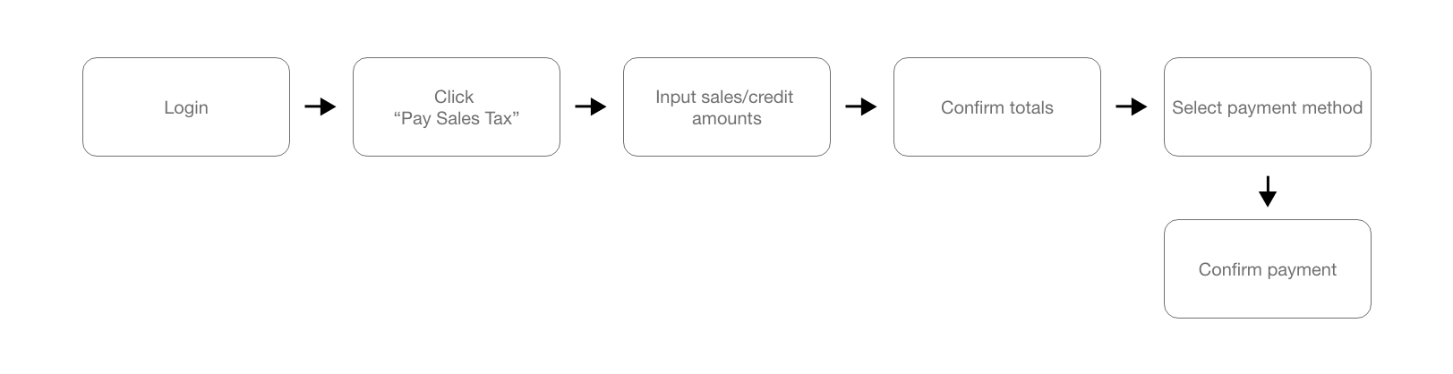
New User Flow
To simplify the process, I reduced the user flow from 10 steps down to 6.
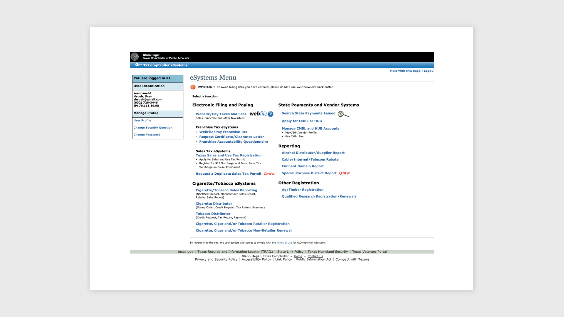
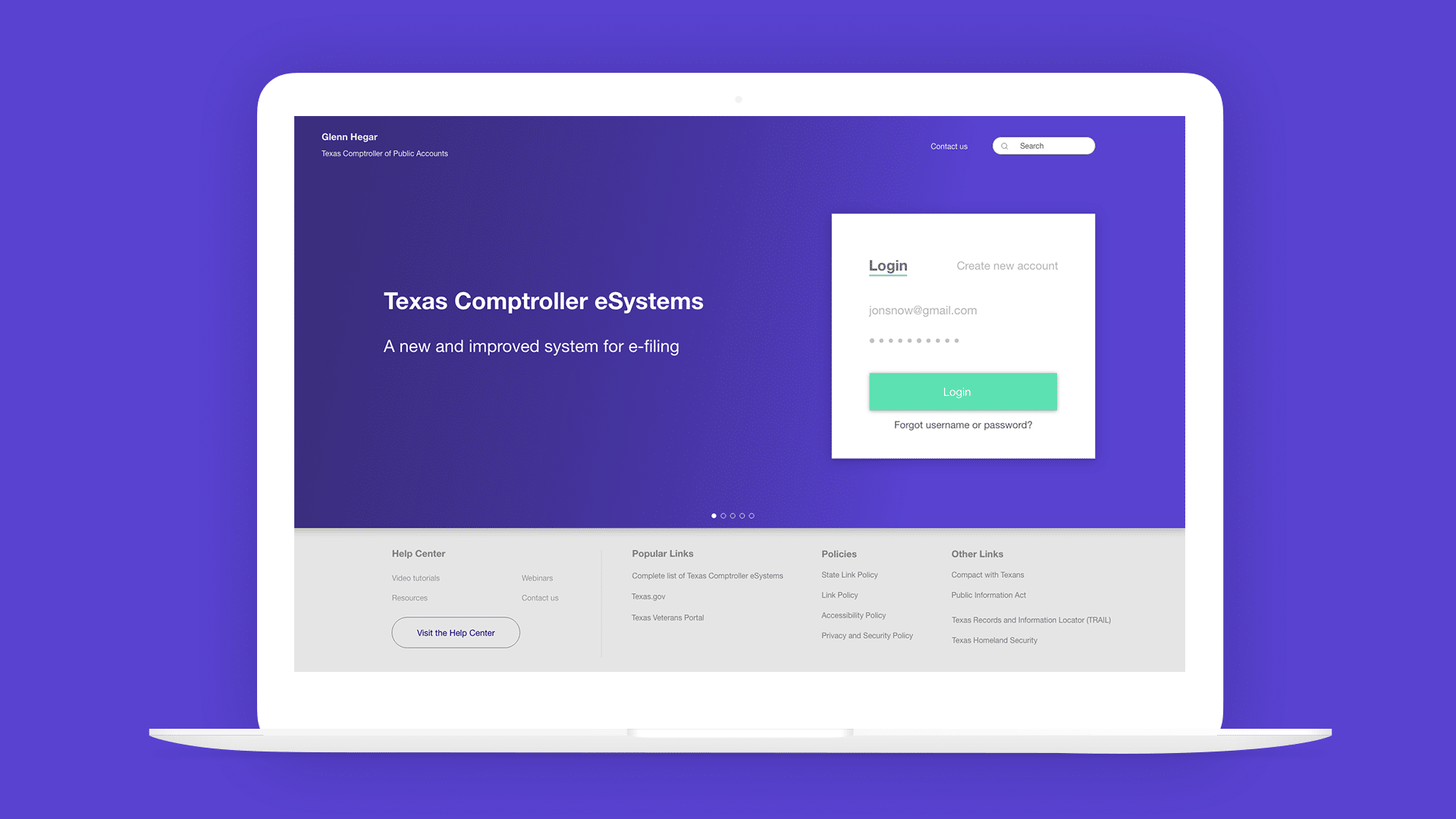
New Landing page.
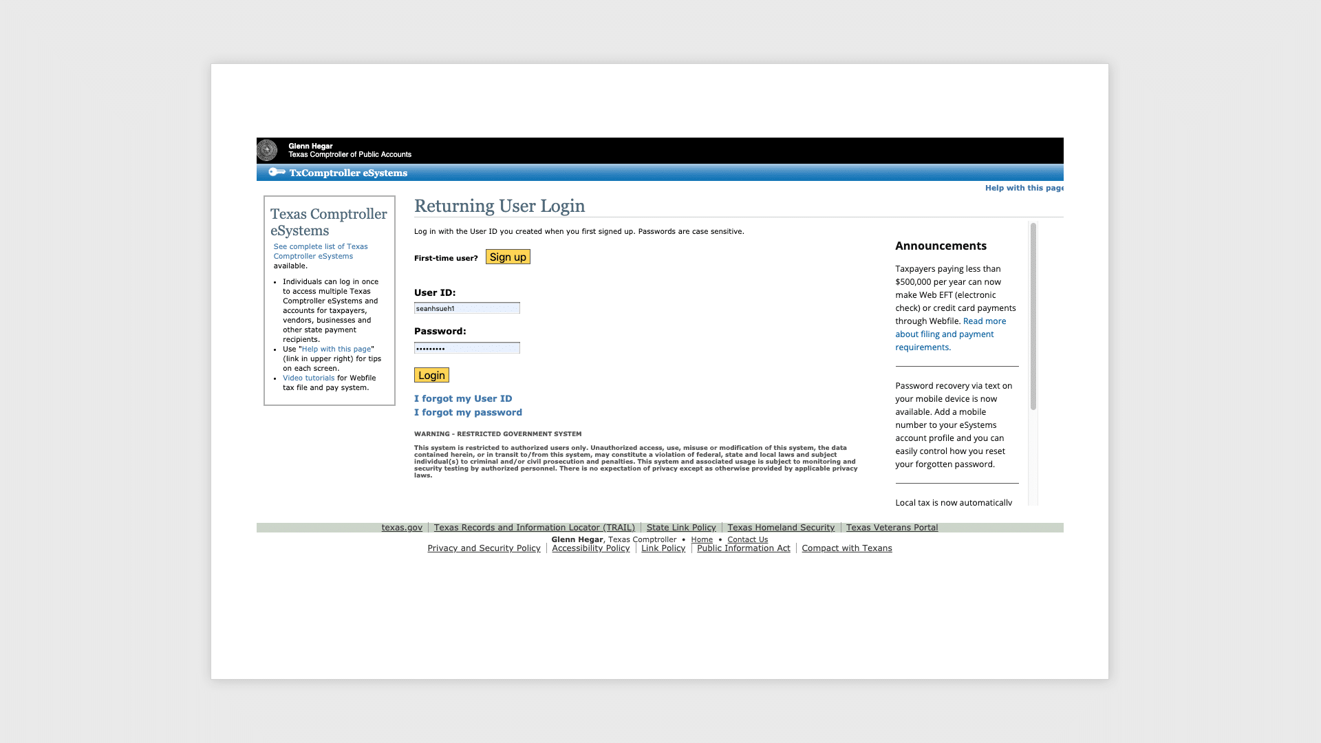
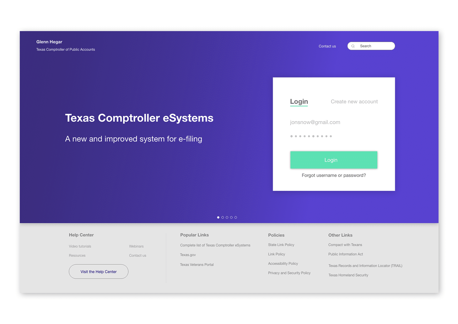
I started by re-designing the log-in page in Sketch to make the call to action clearer and easier to find. The user has easy access to create a new account, retrieve login info, and get to other popular links.
Before:
After:
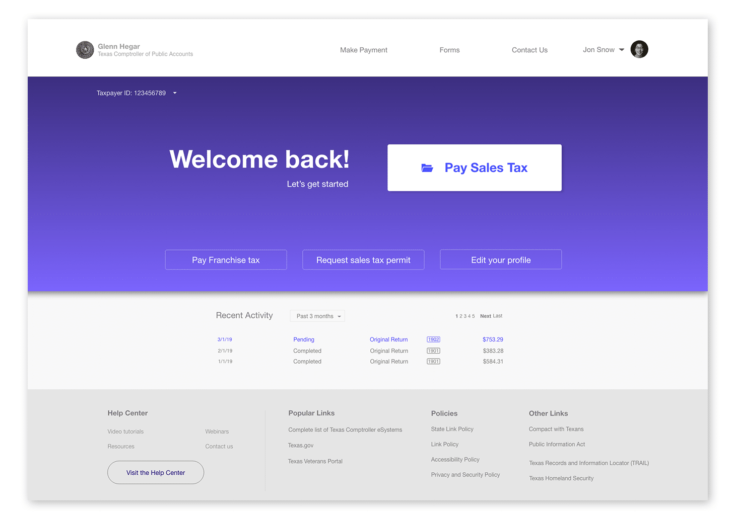
Re-organize information architecture.
After cleaning up the log-in page, I had to re-organize the information architecture. The home page has 20 links under 7 different headings, and several of the links are extremely specific to a subset of business. For example, links about “Timber registration” do not need to be visible to all users.
To clean up the link structure, I re-categorized the links into 3 sub headings: 1) Make Payment, 2) Forms, and 3) Contact us. The special links that are applicable to a small subset of businesses are placed in the footer under “Other links.”
|
Make Payment |
Forms |
State Payments and Vendor Systems |
Special Links |
|
|
Sales tax |
Permits & Clearances | Reporting |
Search State Payments Issued |
Cigarette, Cigar and/or Tobacco Retailer Registration |
|
Franchise tax |
Apply for Sales and Use Tax Permit |
Special Purpose District Report |
Apply for CMBL or HUB |
Cigarette, Cigar and/or Tobacco Non-Retailer Renewal |
|
Request Certificate/Clearance Letter |
Alcohol Distributor/Supplier Report |
Manage CMBL and HUB Accounts |
Tobacco Distributor |
|
|
Request a Duplicate Sales Tax Permit |
Cable/Internet/Telecom Rebate |
Cigarette Distributor |
||
|
|
Eminent Domain Report |
Cigarette/Tobacco Sales Reporting |
||
|
|
||||
Because my primary task is paying sales tax, I made this into a large button on the front and center of the page.
Home Page before:
Home Page after:
Pay sales tax process redesign
The current process to pay sales tax is confusing and convoluted. Since most users were getting lost in the process to sales tax, I had to remove distracting links and make the primary job the main focus.
Pay sales tax process before:
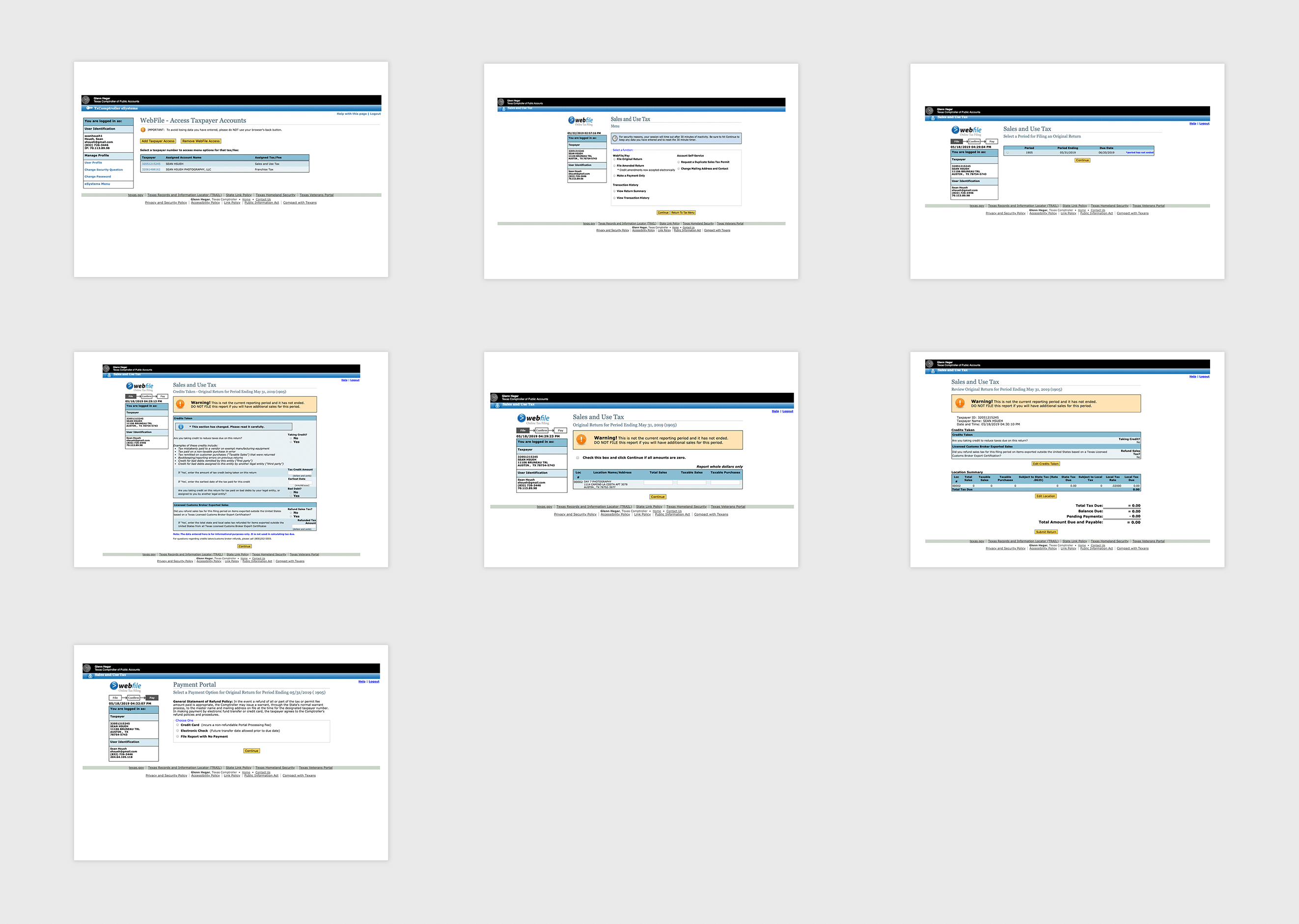
There are many opportunities to get lost in this current flow.
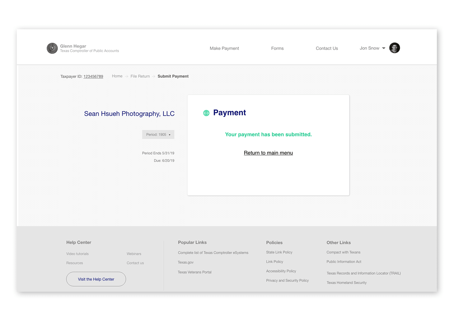
Pay sales tax process after:
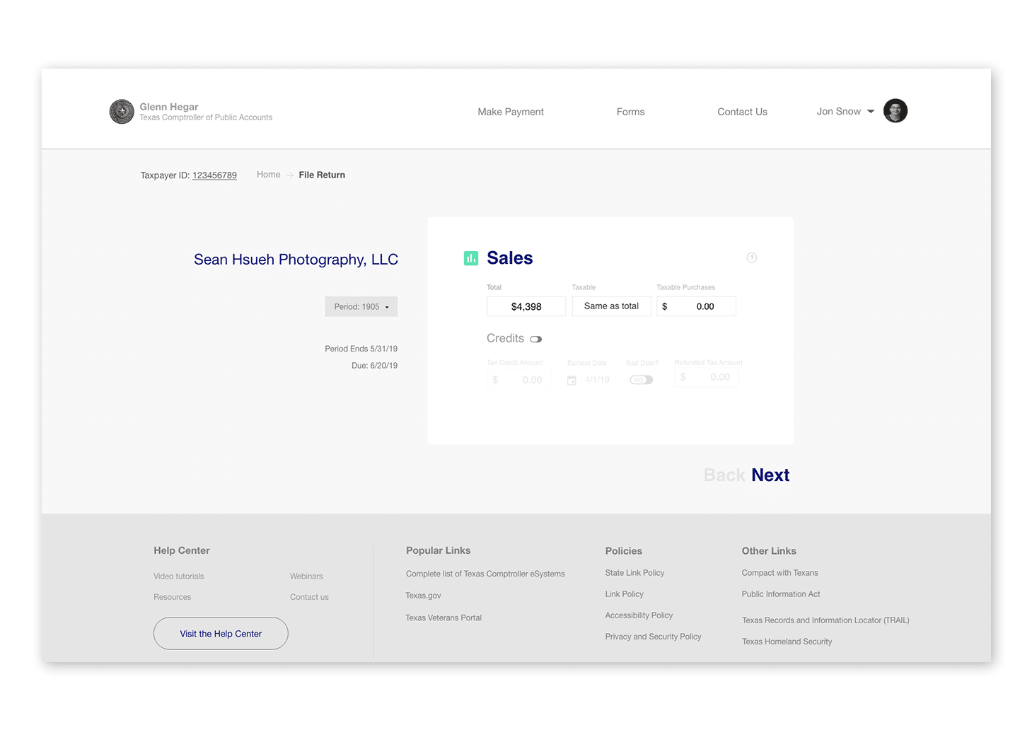
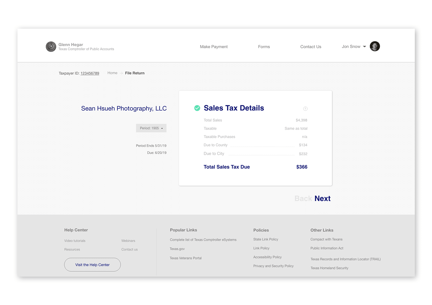
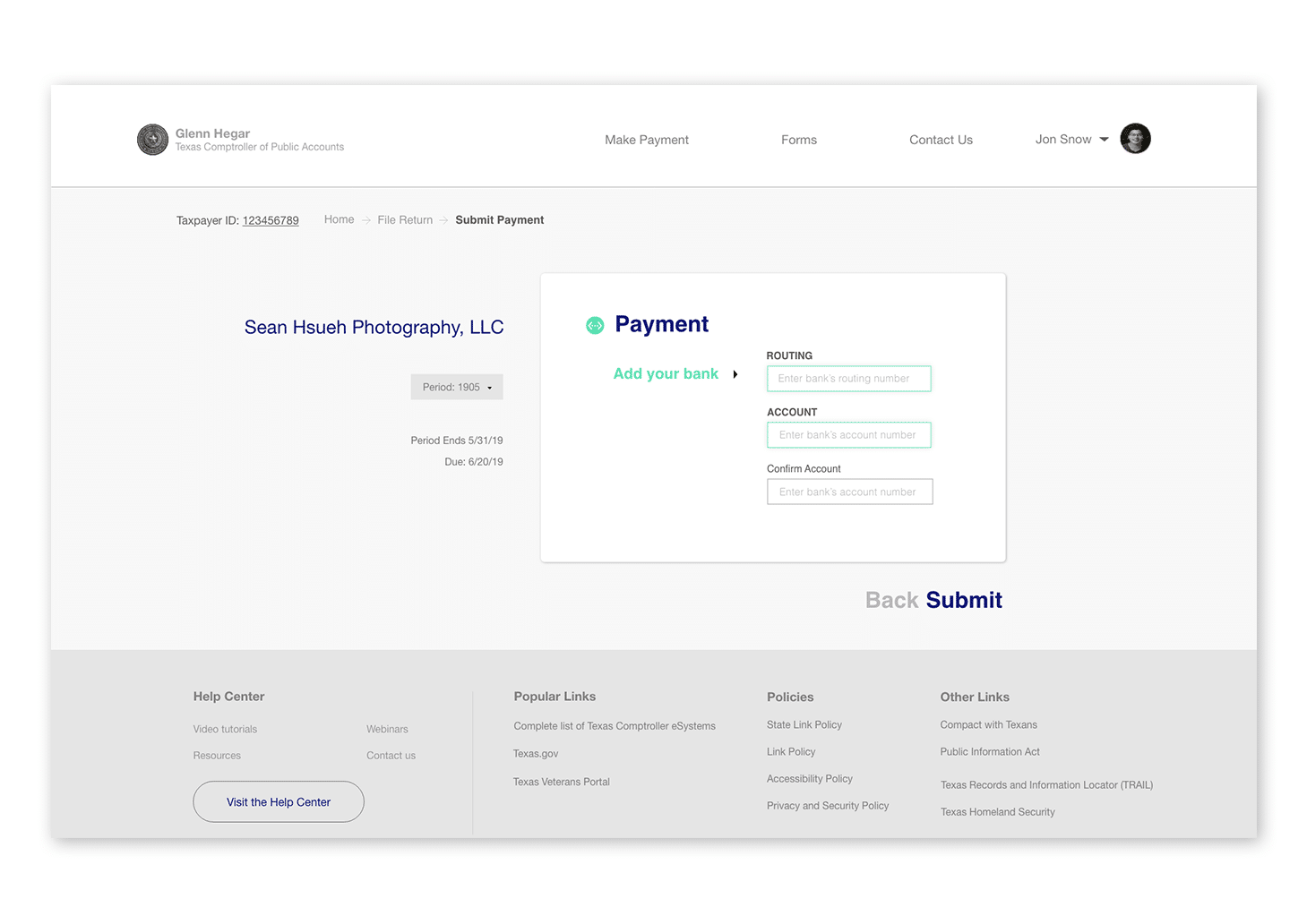
Payment Screen
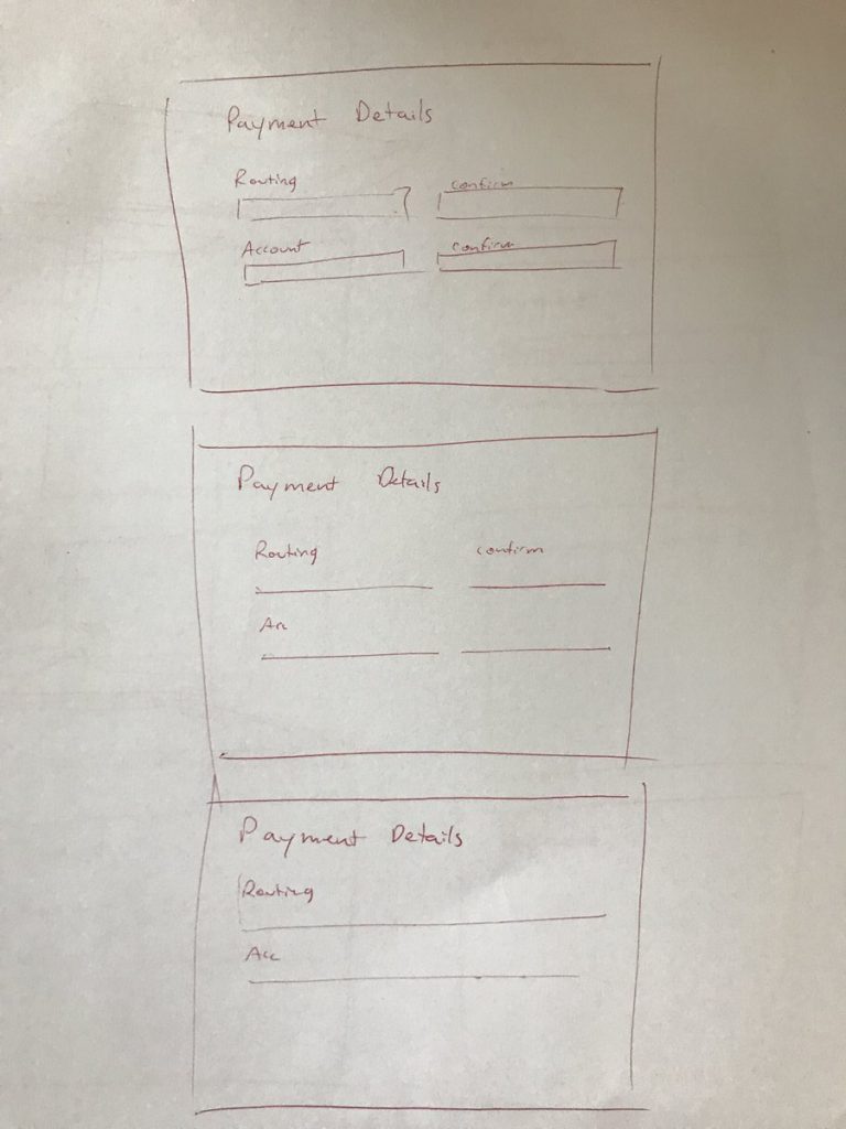
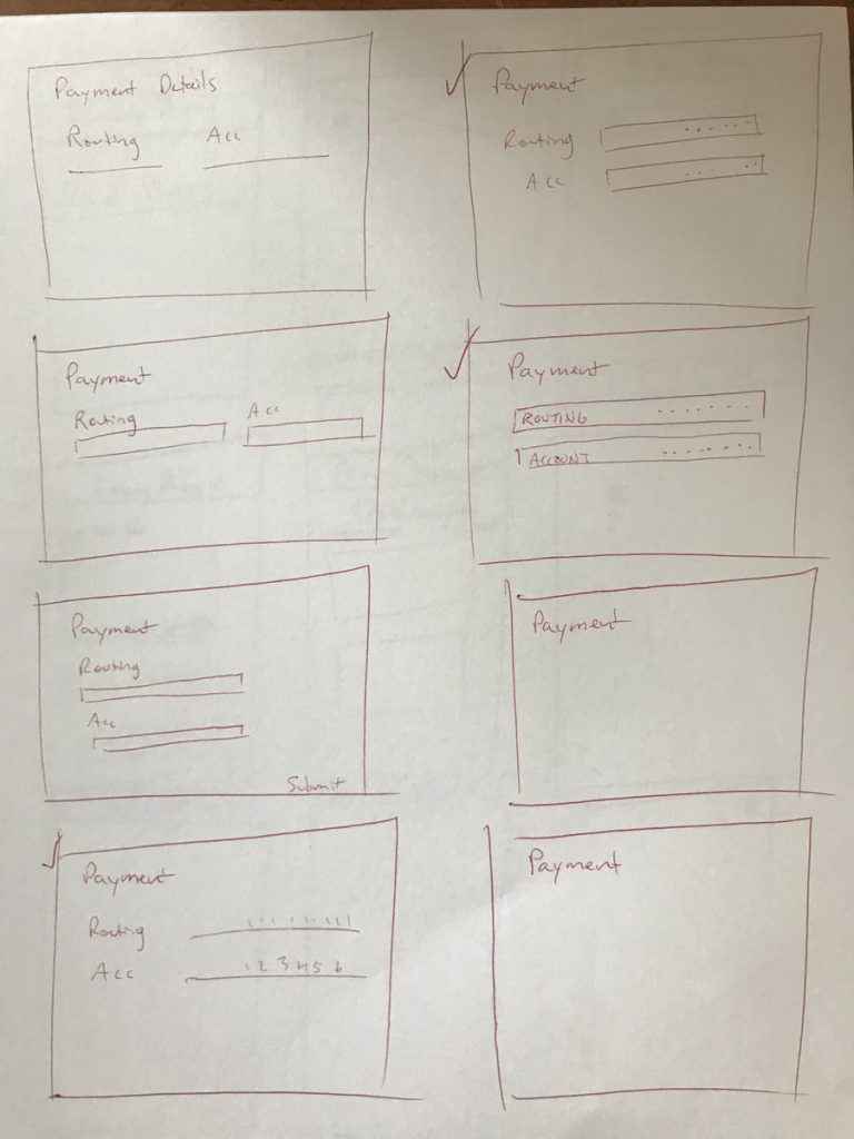
While finishing the Payment screen, I had to go back to pen and paper to narrow down my ideas for a layout:
Payment screen after:
Validation
To test the effectiveness of my redesign, I returned back to the same users to record their experience. To summarize, I found that the user experience was greatly improved:
-
-
- 5 out of 5 users successfully clicked the correct link (pay sales tax) on the first try.
- All users completed the task of paying sales tax once they began without getting lost.
- All users found the payment process easy to complete.
- The average rating of the overall experience and ease of use after the redesign was rated on average a 9 out of 10
-
“Wow it feels so much cleaner.”
Conclusion
By narrowing down the user-flow from 10 steps to 6, simplifying the information architecture, and adding visual hierarchy throughout the website, I was able to drastically improve the user experience by making it simple and easy to navigate.