uShip Account Settings Redesigned
Account Settings Redesigned
Background
uShip is an online marketplace that connects shippers with carriers, primarily for large items like cars and furniture.
With over 8 million users on the platform, we had outgrown our in-house solutions for user management, and it was costing the company valuable resources. We eventually chose Okta as our account management provider, which meant we needed to migrate all of our users to their database.
This also meant we needed to create a new account settings pages at uShip to connect with Okta, and our account settings had not been touched in over 10 years.
My role: I was the sole designer in charge of user research, design, and testing.
Research
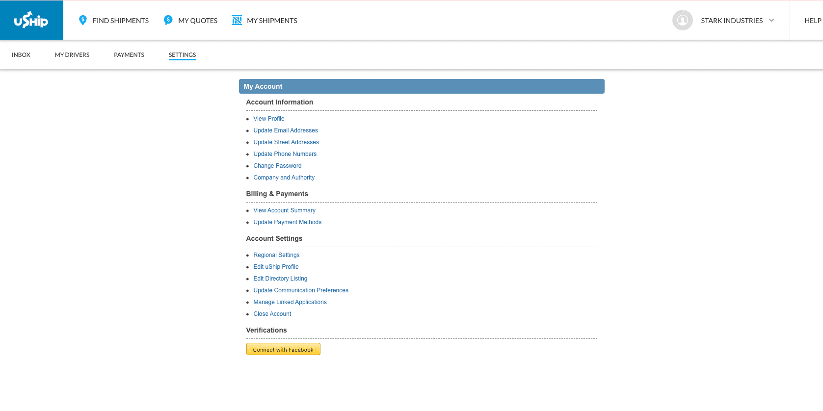
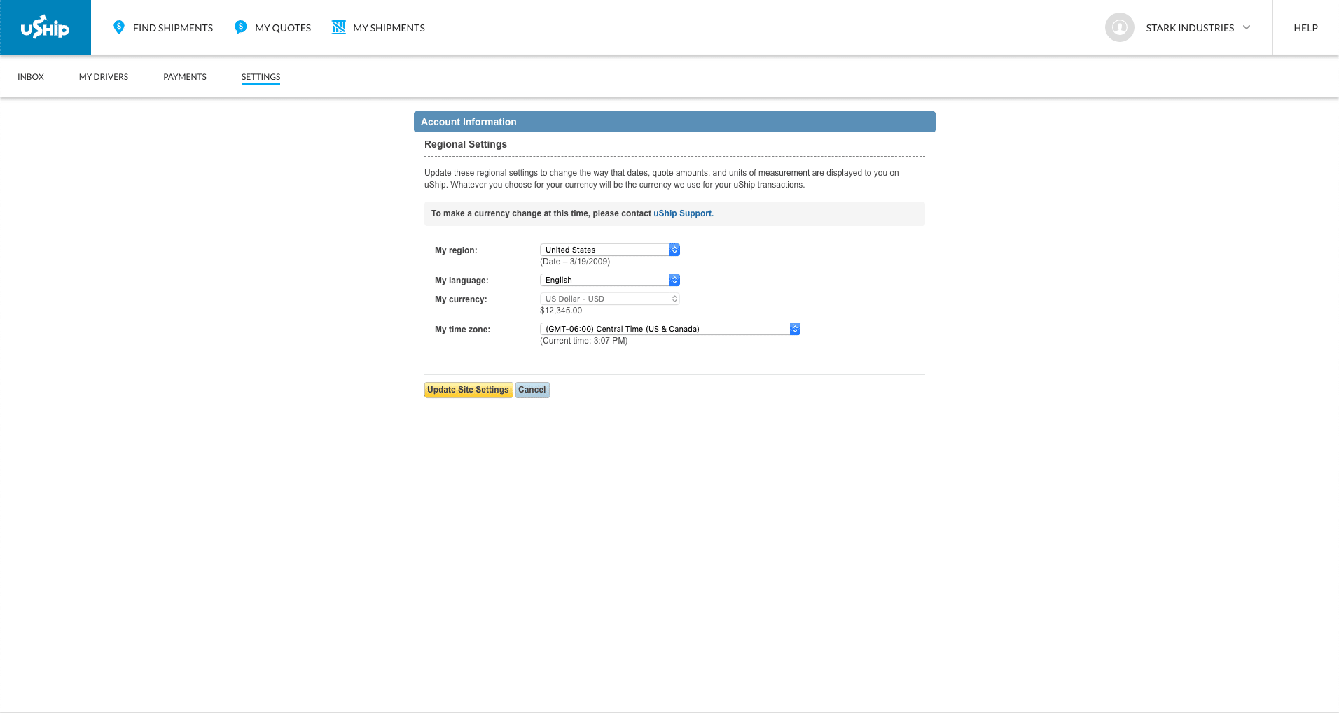
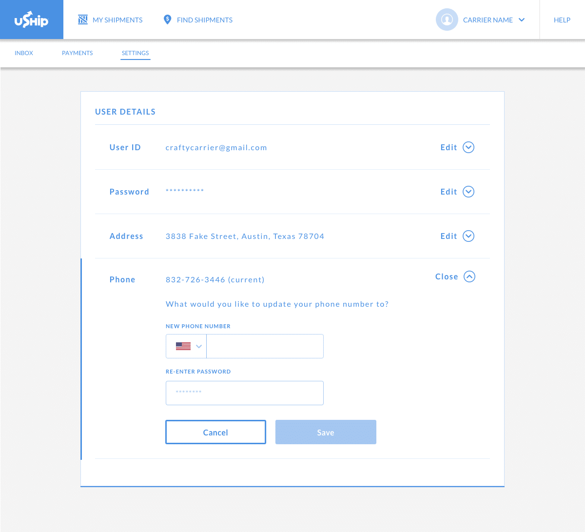
One of the main problems at first glance was the abundance of links. Every section has its own link, which meant a lot of clicks if a user needs to change multiple settings.
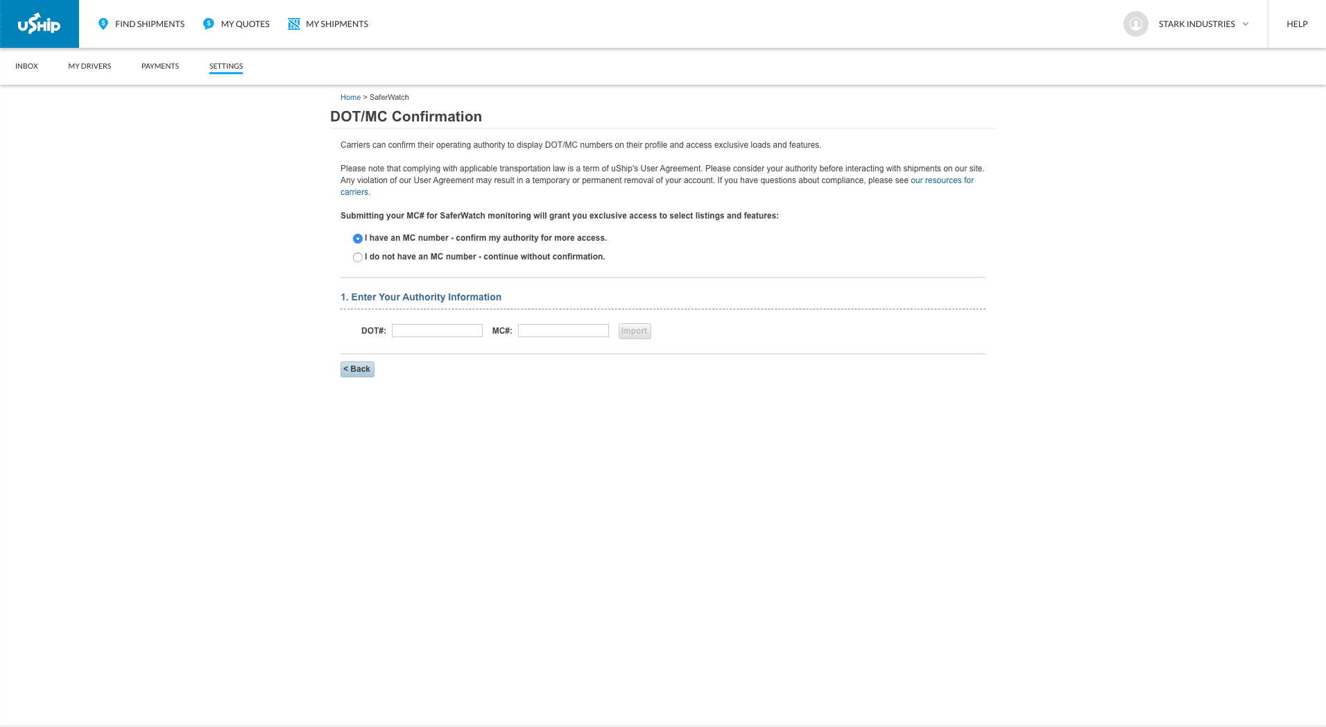
User Interviews
To get more perspective on this page, I wanted to hear from actual people who were not designers. I recruited employees within our company to tell me how they felt about this page.
During my user interviews, I heard the following:
“There is a lot of wasted space.” – Caleb, QA
“…[there are] Lots of links that aren’t being used or titles that aren’t accurate. Links could be grouped…” – Tom, Customer Support
“We spend a lot of time guiding people with that process. It’s not an intuitive experience.” – Rachel, Customer Support
“Users often are confused about the username vs email, and we use both identifiers inconsistently throughout the experience. We also have a lot of unverified emails on the platform, which is a source of fraud.” – Customer Support
Technical Constraints
I also learned about the technical constraints around this page.
Tech Debt – Because these pages have not been touched in over 10 years, there was a lot of technical debt that had accumulated. Working in “old” code would be more work than working in “new code.”
Multiple teams with different priorities – With several teams owning different areas of this page as well as on different product roadmaps, we would not be able to redesign every page within these settings.
Problem Statement
After facilitating these interviews and learning about the technical constraints, I felt confident I understood the problems:
Information Architecture
The organization of links and groups was not intuitive, and it was a cause of confusion for every day users.
Username Confusion
Users were not clear about the distinction between username and email. Throughout the experience, different identifiers are used, which makes it seem like two different people.
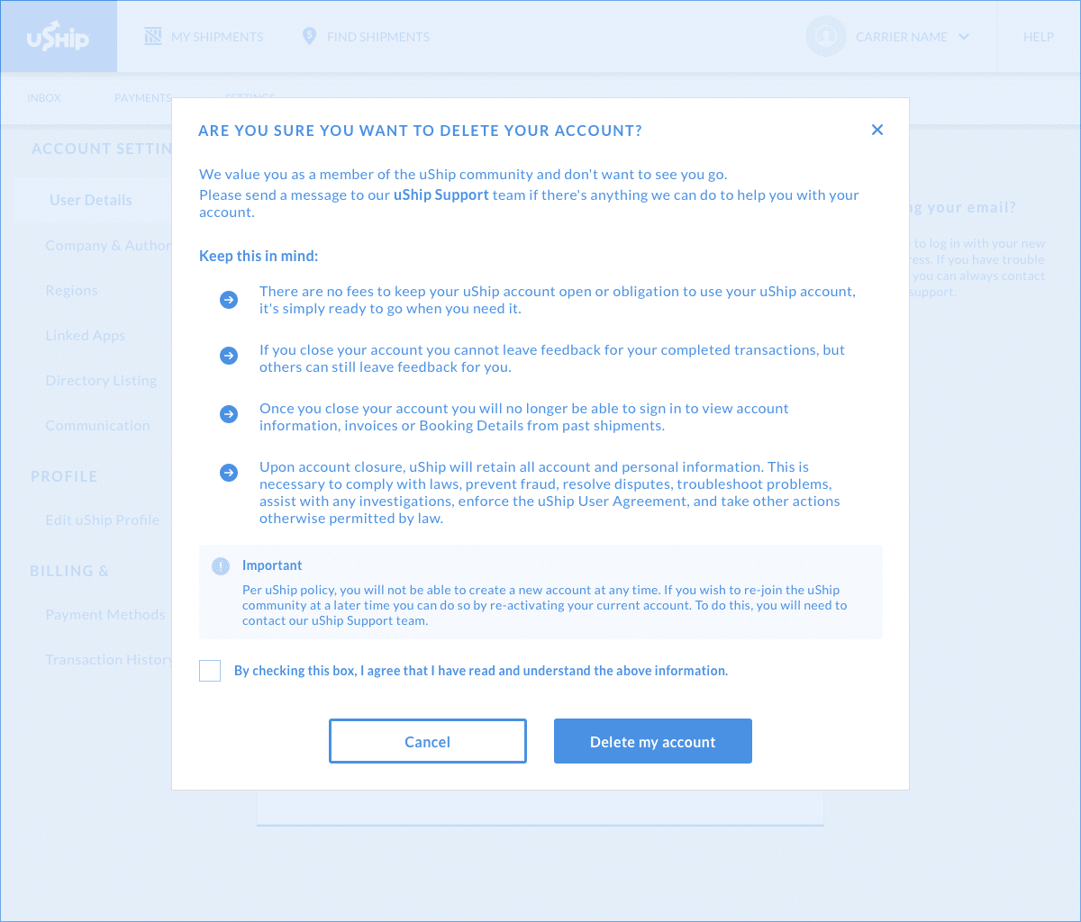
Account Security
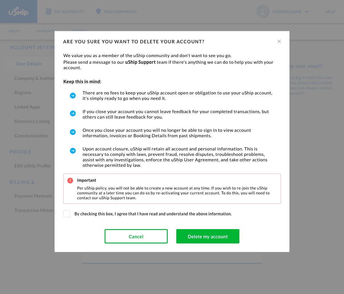
Changing important account information has no safety measures to prevent fraudulent activity.
Goals
The problems above helped guide the goals and metrics for success:
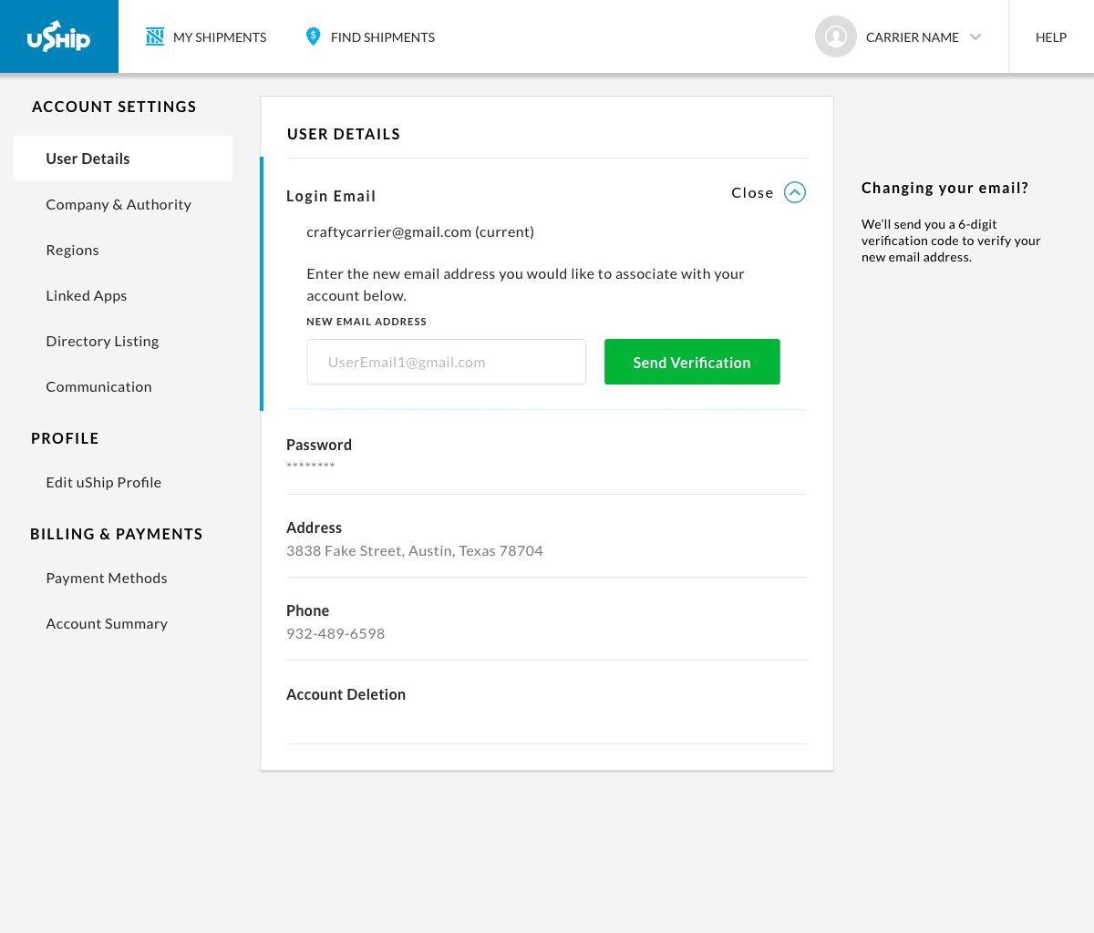
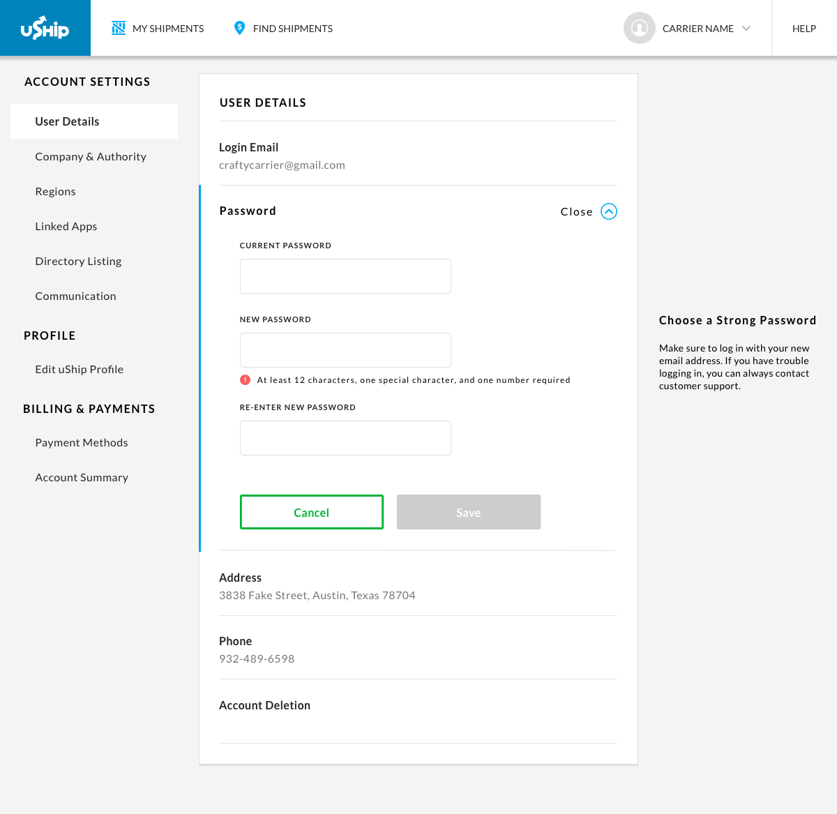
Email as a login – Remove confusion about username and email by using only email at login.
Intuitive Layout – Users should be able to quickly navigate the page without asking questions.
Safety measures around changing email – Reduce usage of fake emails, and ensure that a user could not accidentally type the wrong email.
After aligning on these goals with the product owners, I moved on to explore how this could look visually.
Ideation
Knowing our problems and goals, I wanted to discover ways other companies are addressing our issues through a competitive analysis.
Competitive Analysis
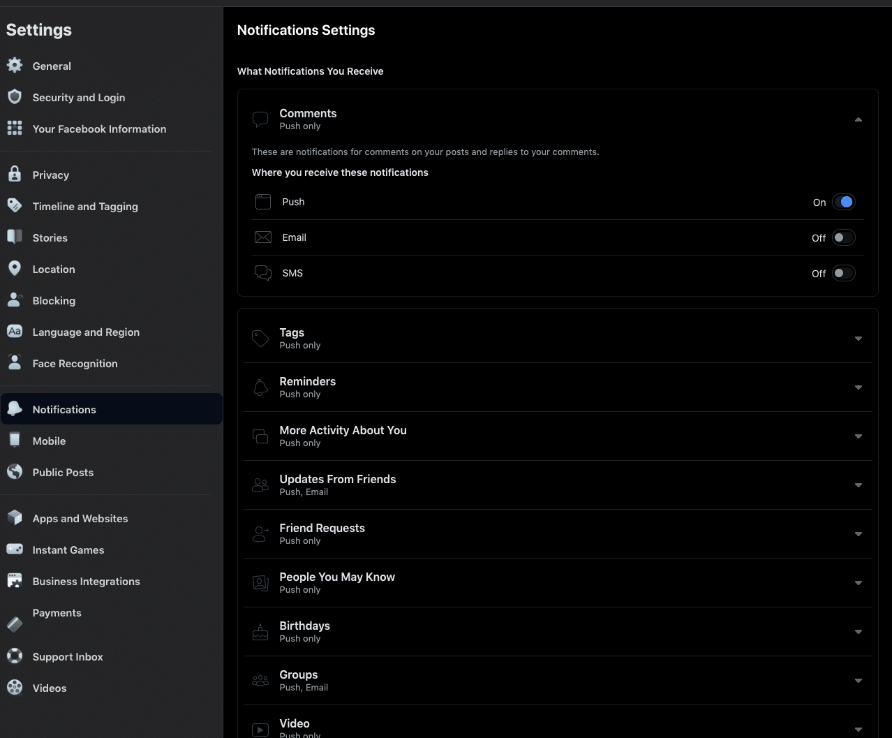
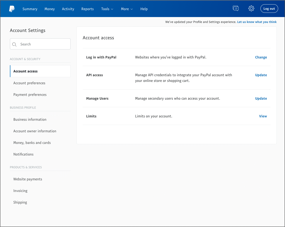
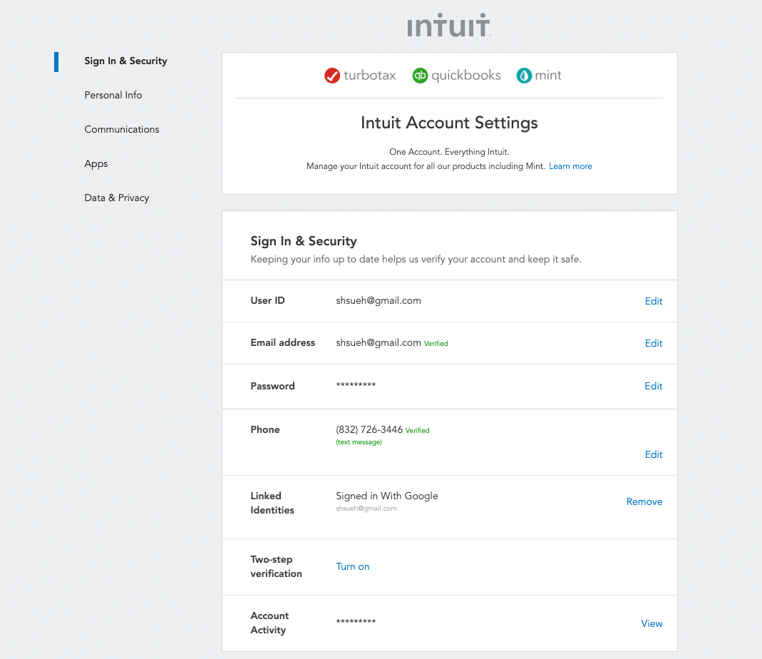
I looked at companies like Facebook, Paypal, and Intuit because of their background in user profiles and financials – both of which demand high security.
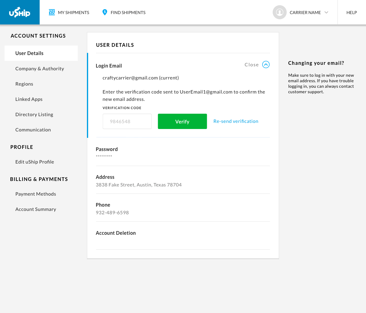
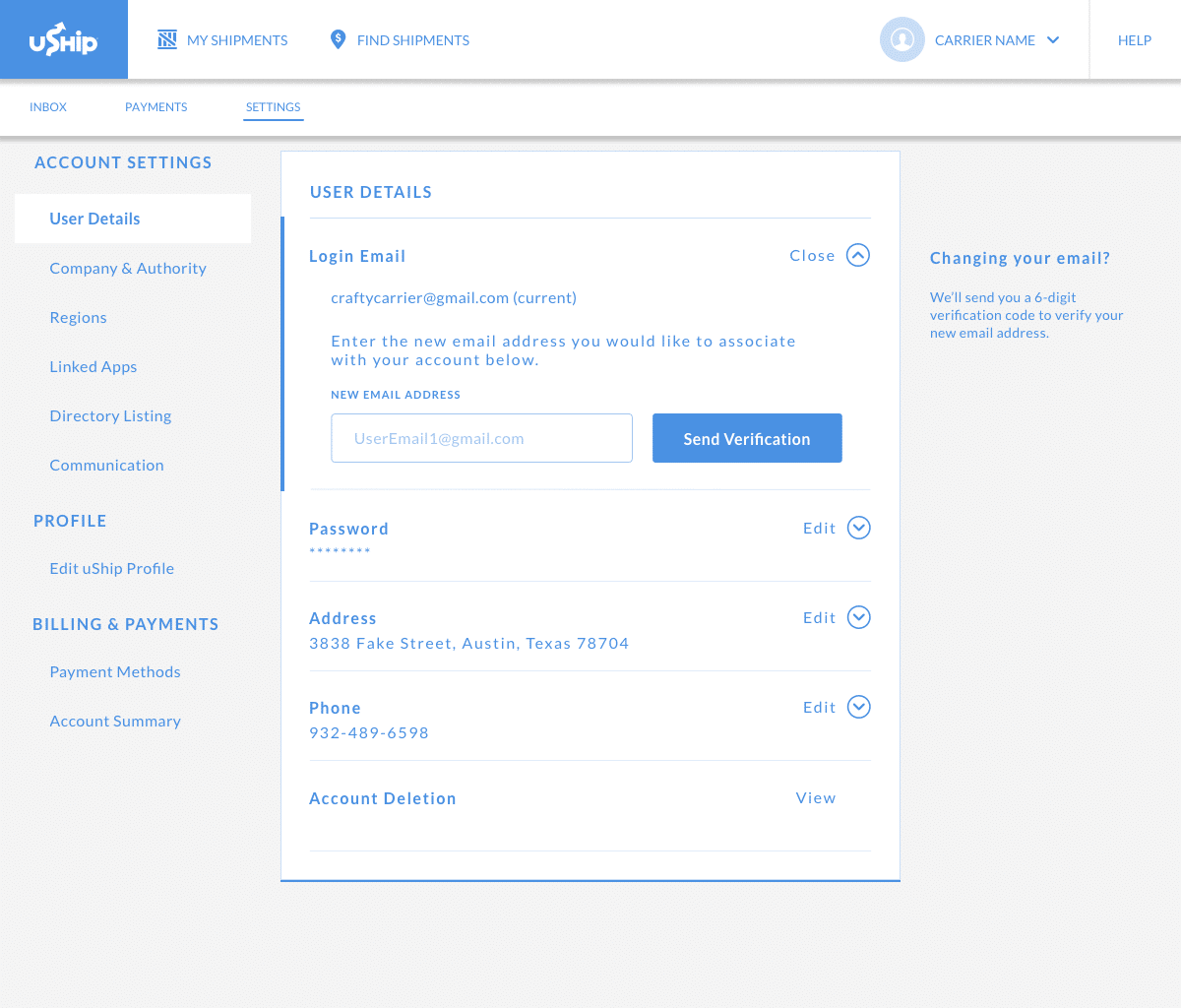
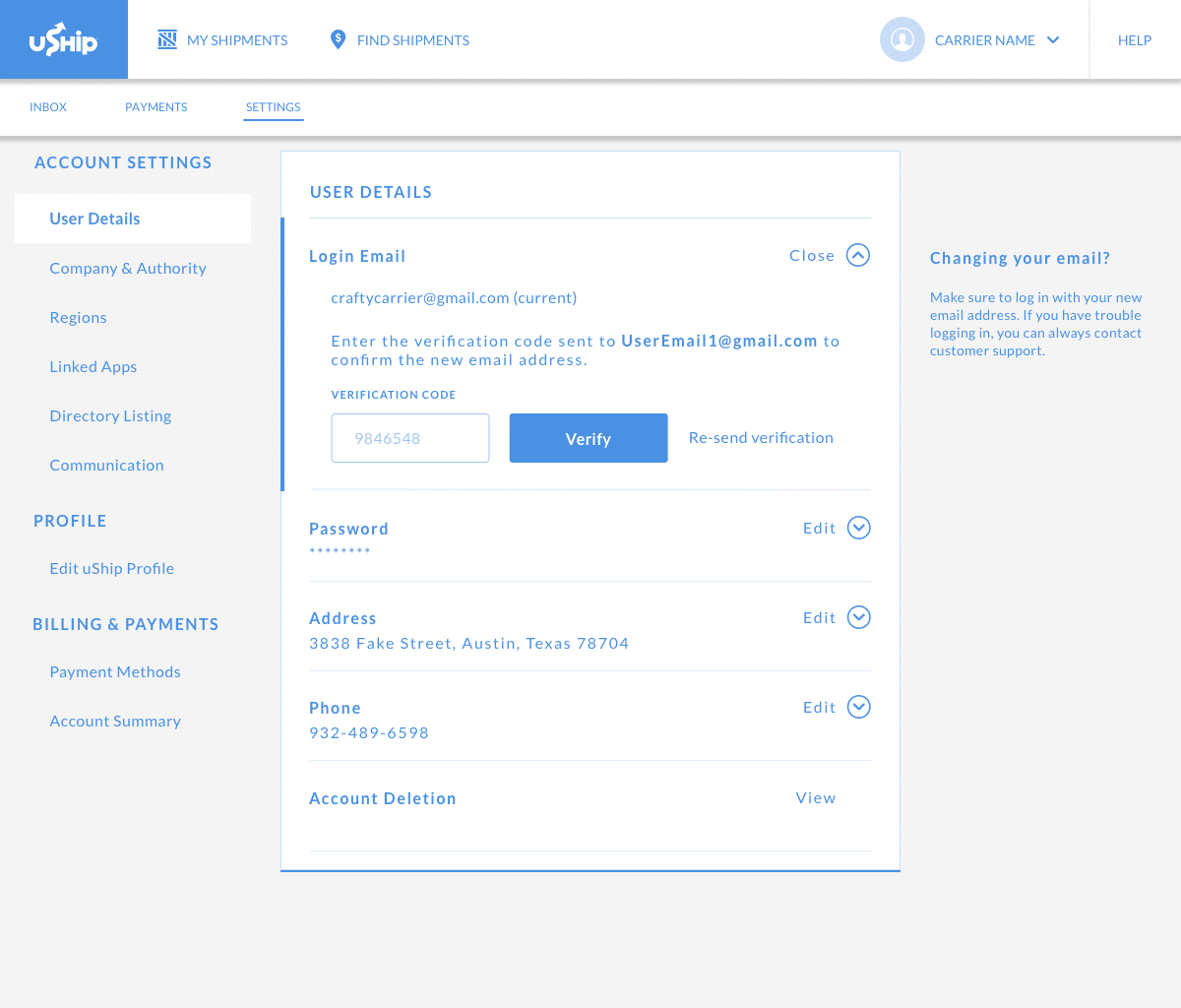
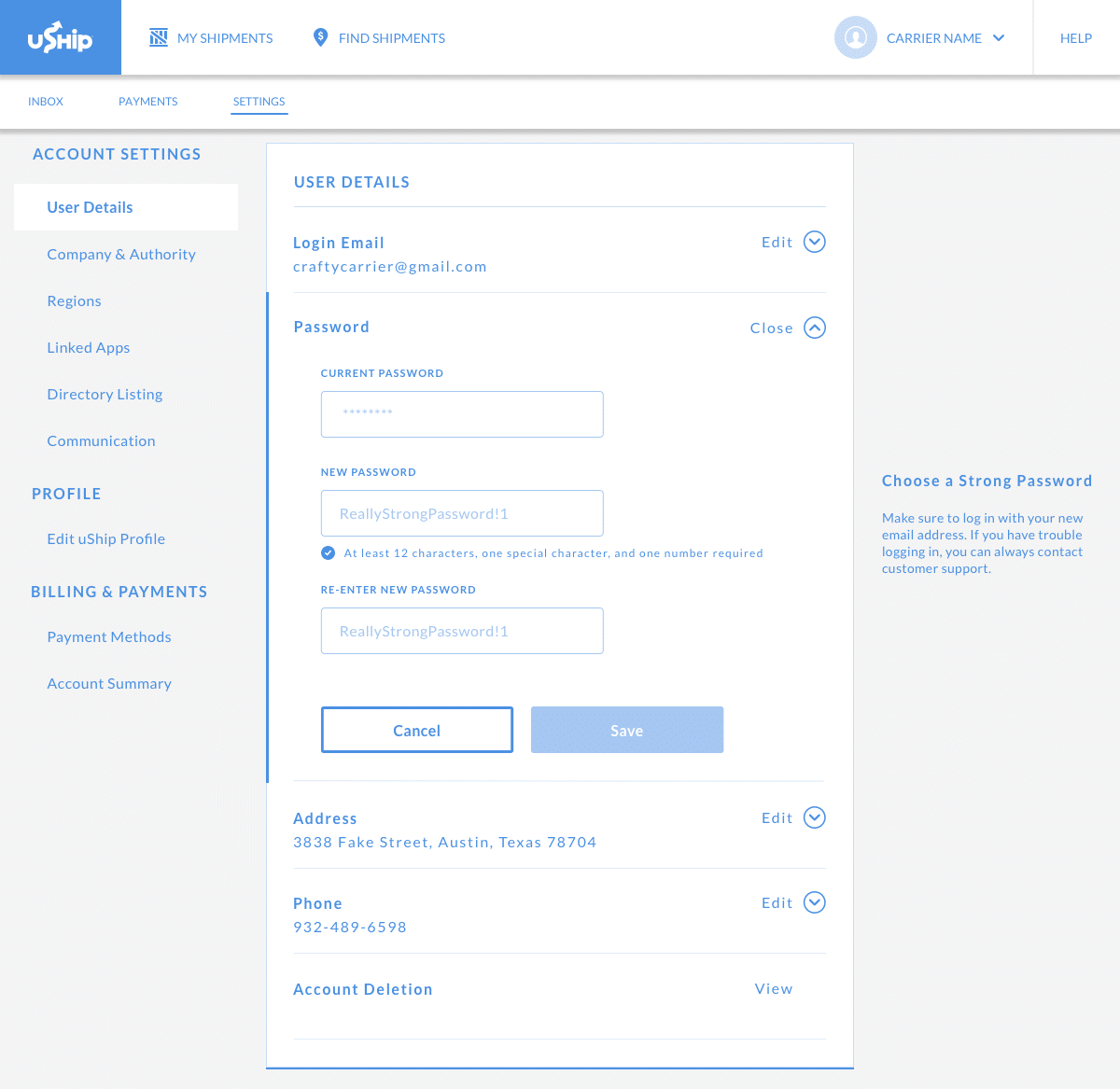
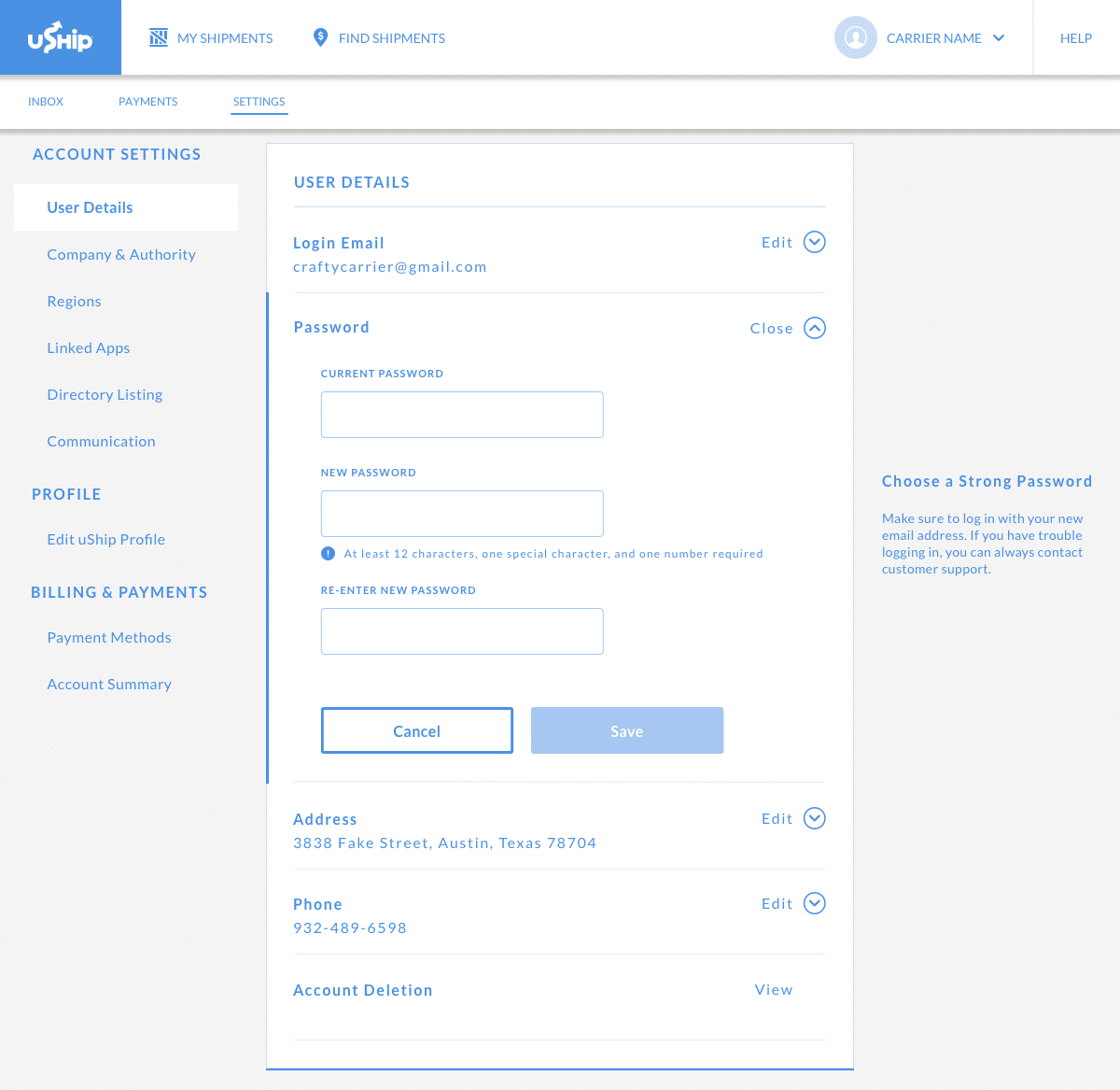
2-Step Verification
I looked into 2-step verification for safety measure around email changes. Based on best practice and industry standards, I created this flow to discuss with my team:

Job Stories
With the Job-to-be-done framework, I created three Job Stories for my designs:
→ When my email has changed, I want to easily change my email, so that I can login with that email.
→ When I am changing my email, I want a seamless process that helps ensure account security, so that there is no fraudulent activity on my account.
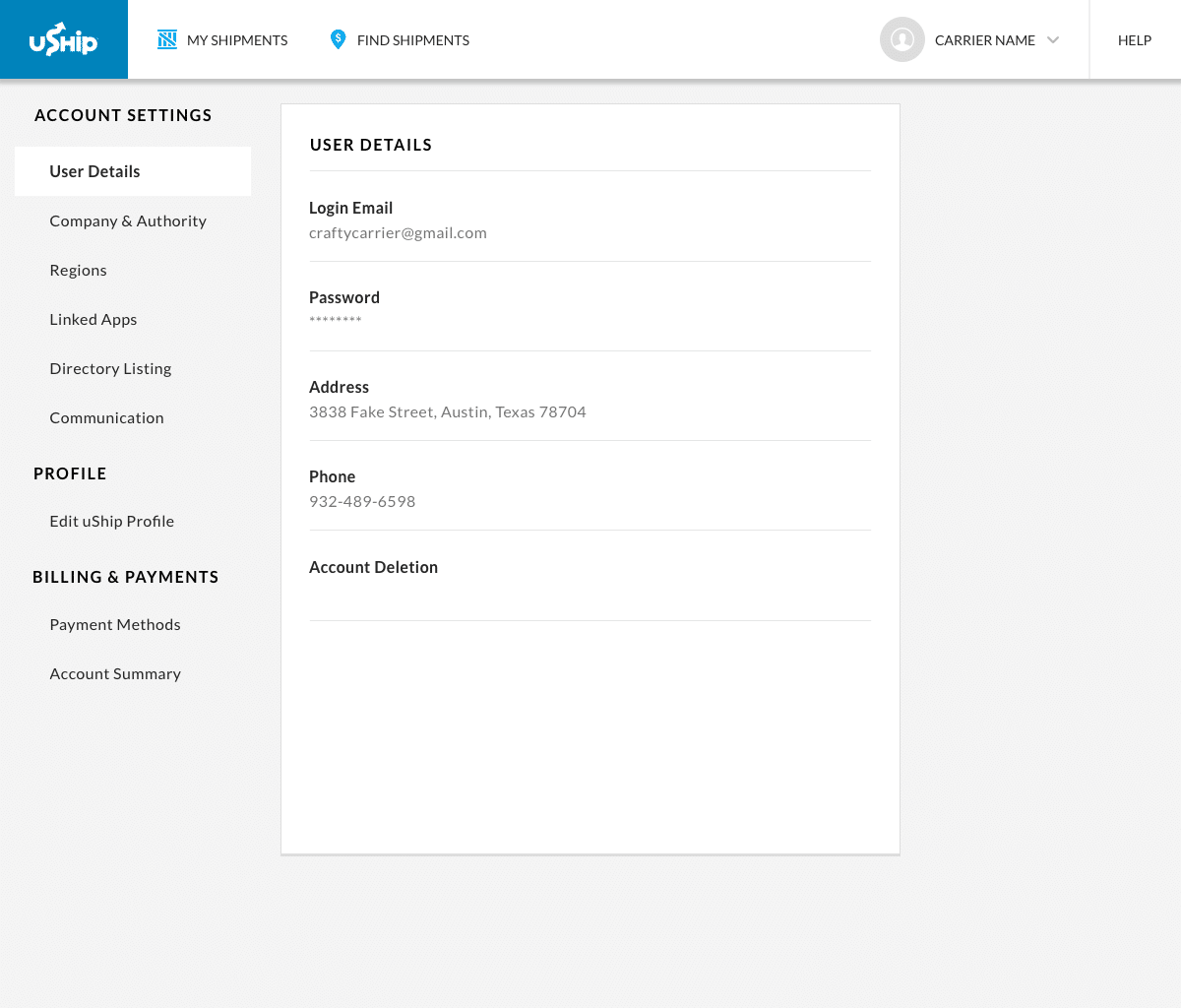
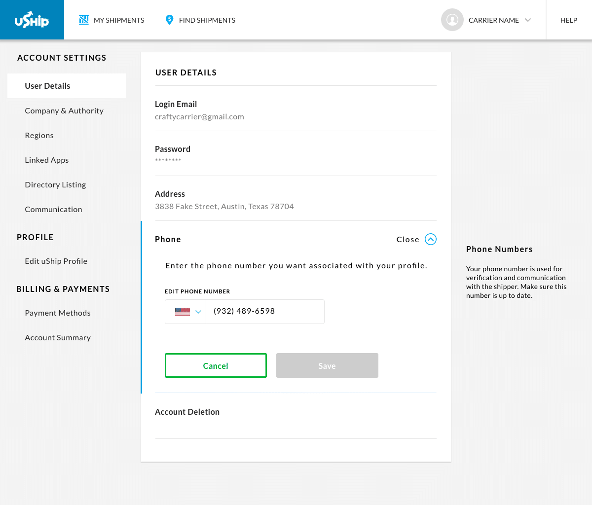
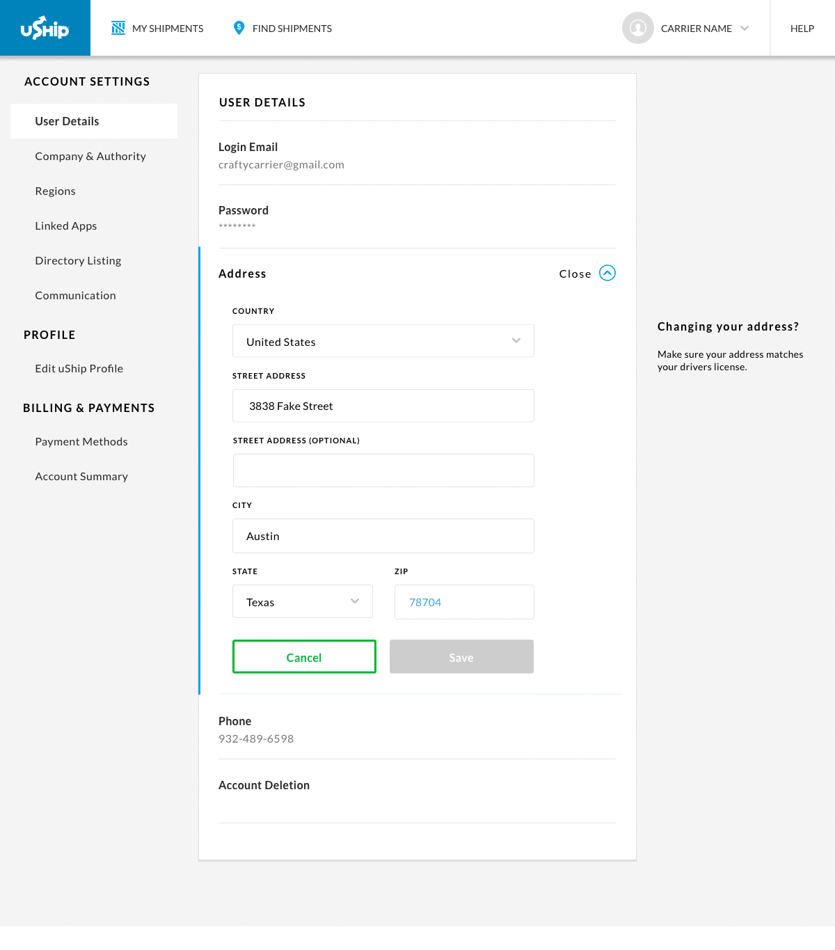
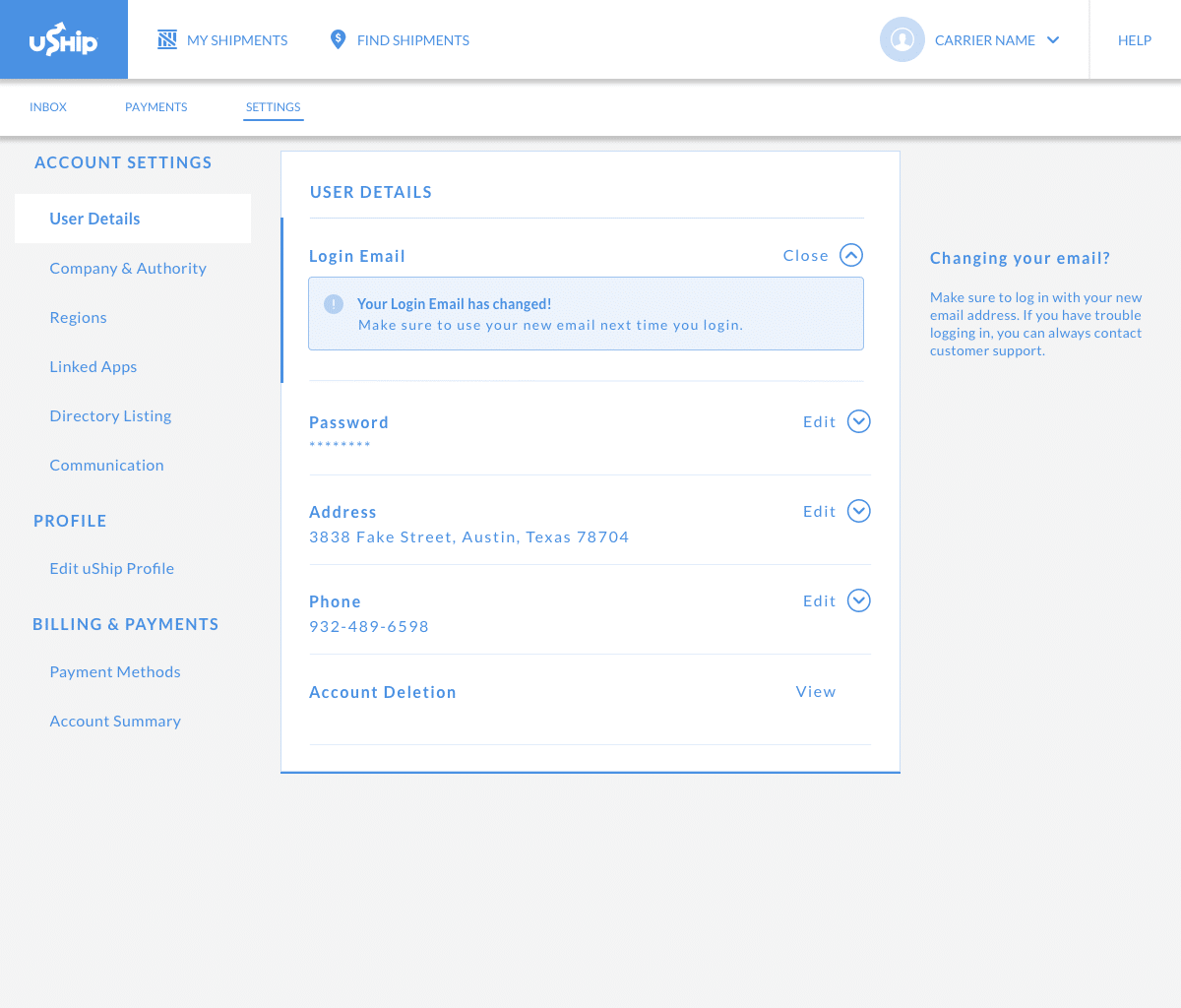
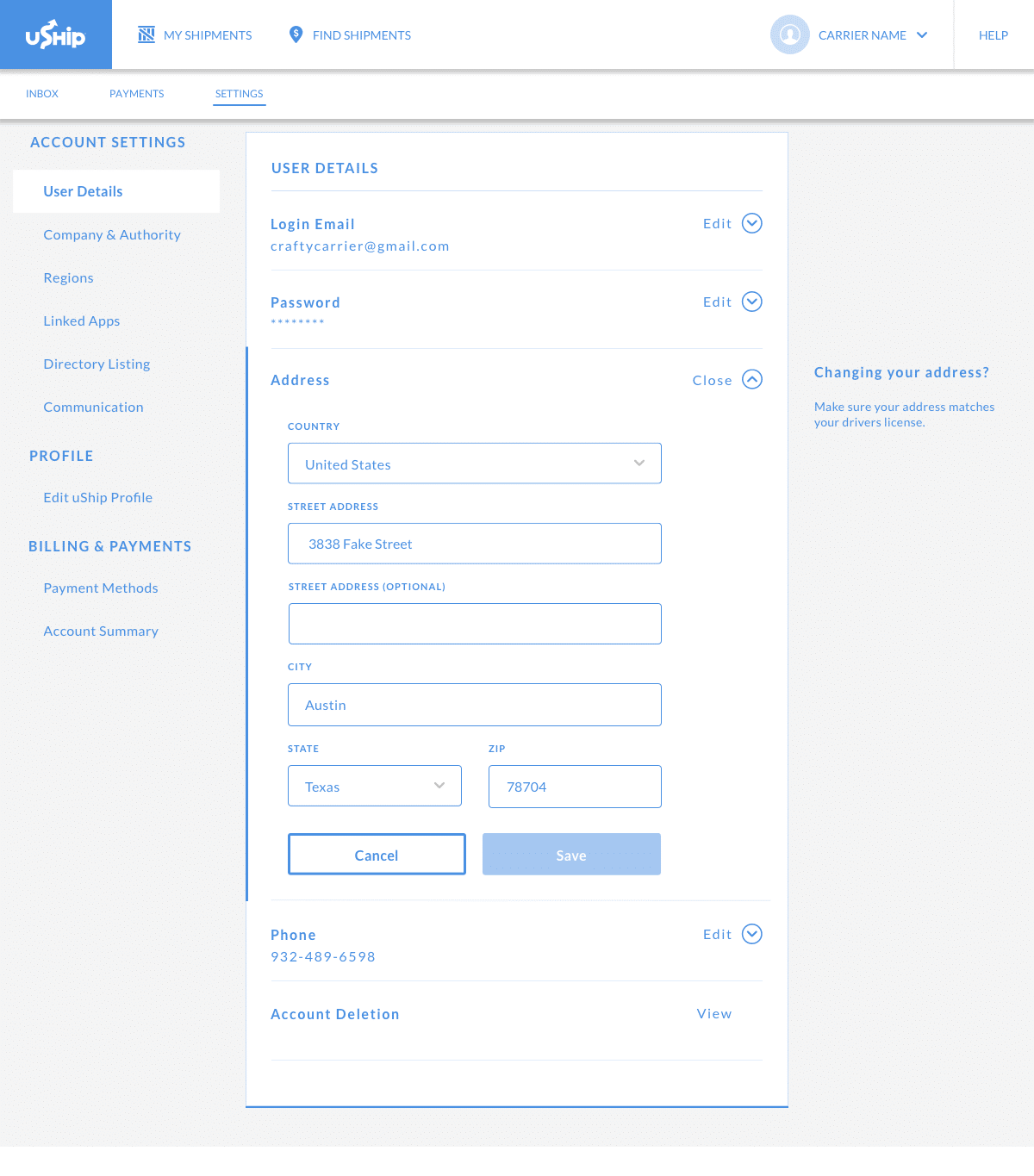
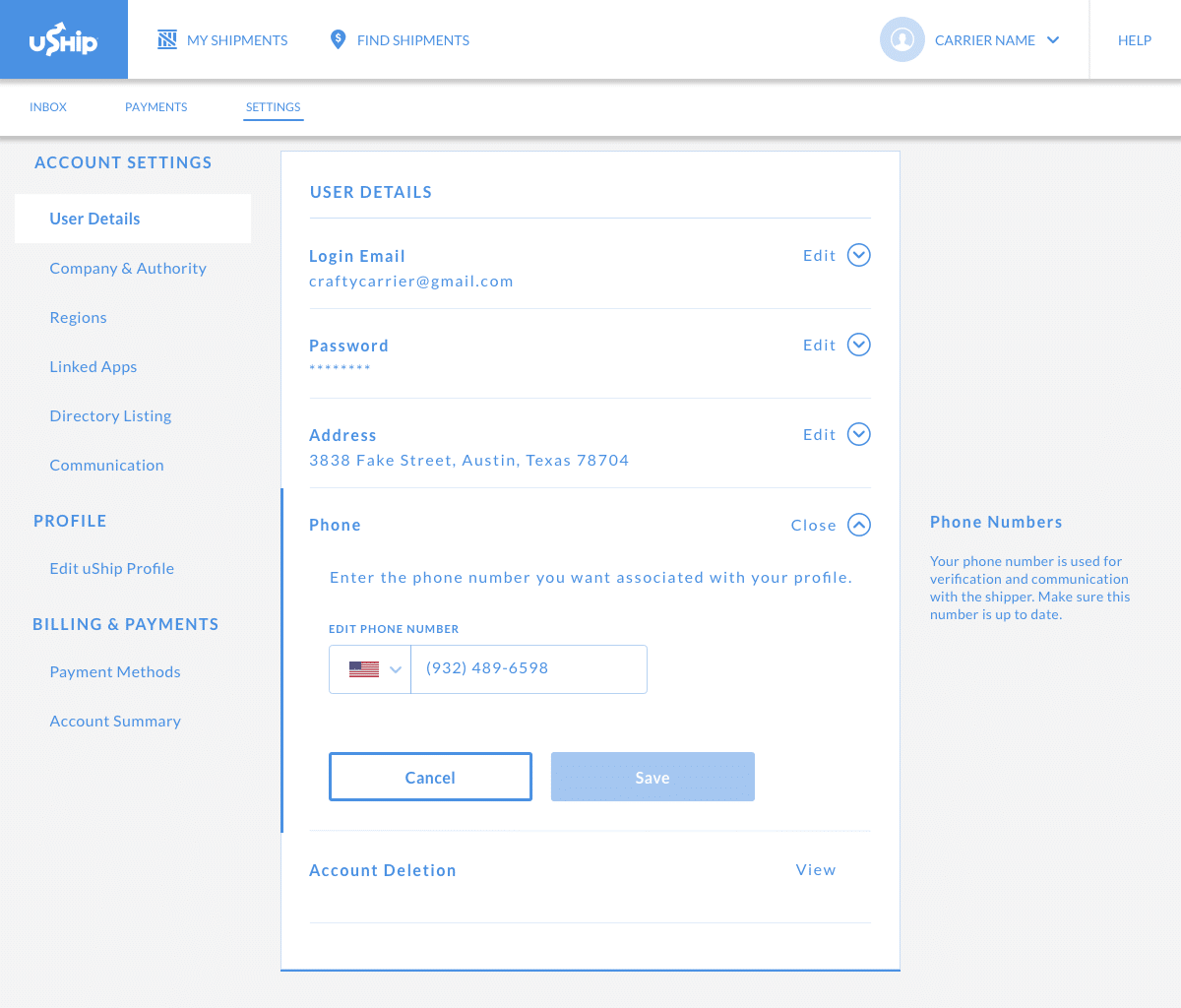
→ When I want to change other settings of my user details, I want to see the most important settings, so that I can make quick changes to my address, phone, password, or email.
Through competitive analysis, a new flow chart, and job stories, I was able to add clarity on the design strategy and share it with my engineering team. After getting team alignment, I began designing low-fidelity wireframes.
Design
My initial designs included mostly a one and two-column layout.
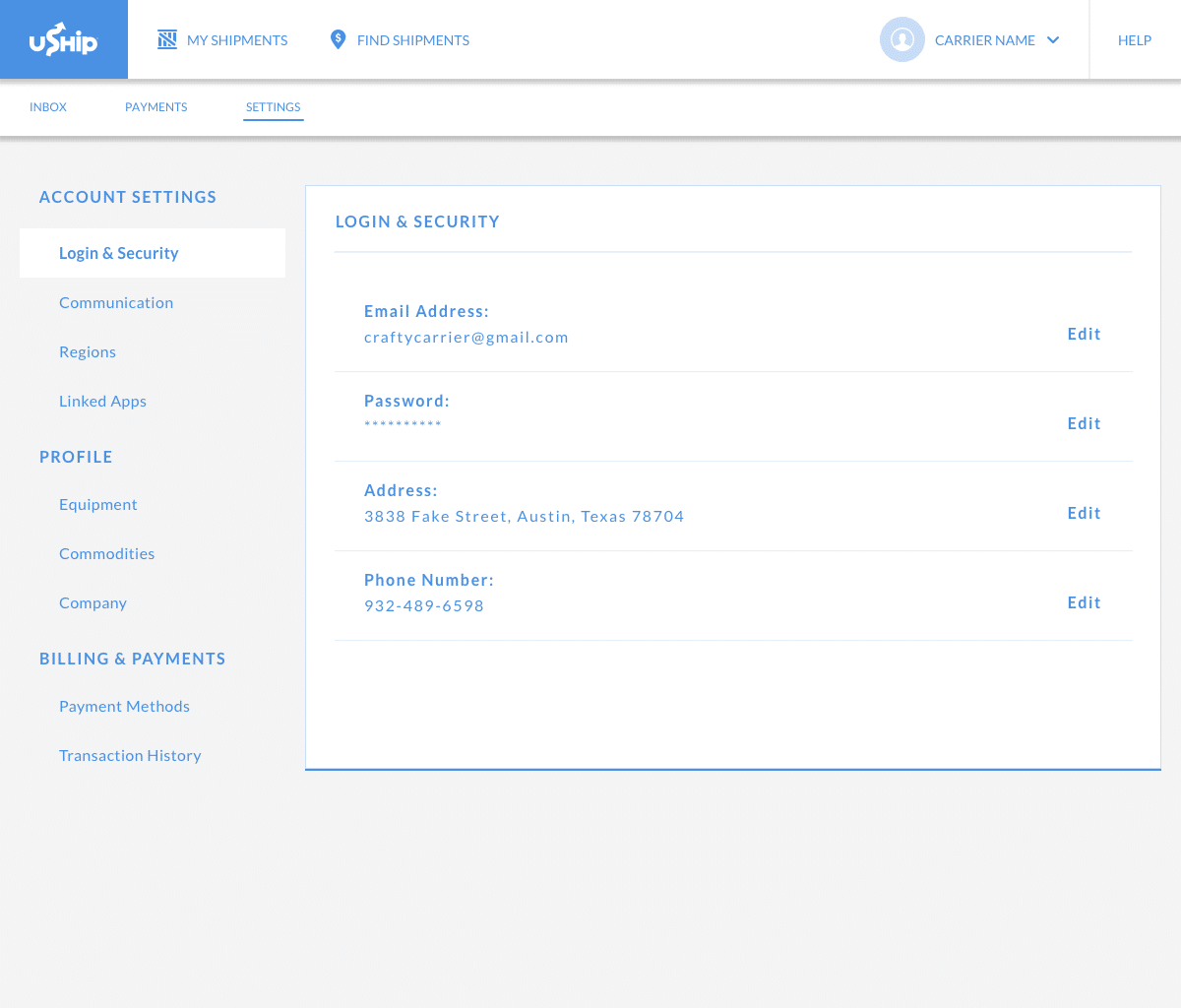
Sticky Side bar or not?
I wanted to include the sticky sidebar on the left as a way to unify the account settings section and empower the user to make changes quickly. I created multiple designs with and without the sidebar.
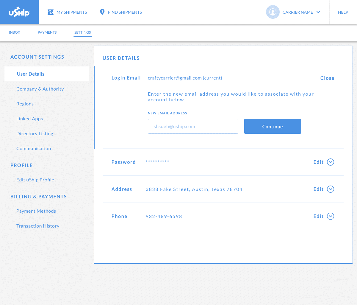
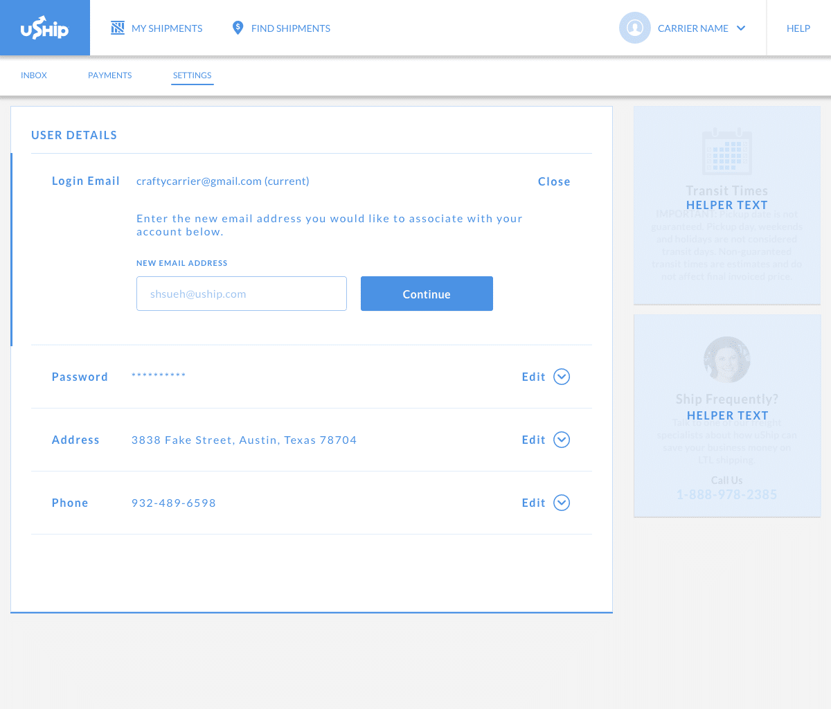
Iterations
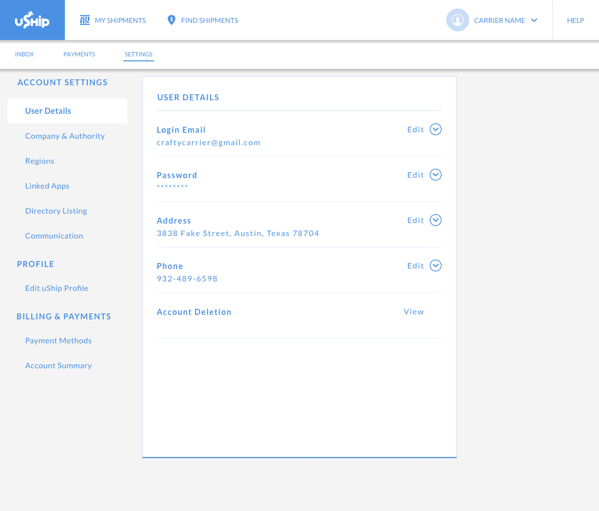
After initial feedback from my design team, I eventually landed on a three-column layout, which would match another layout within our design system. This layout allows for the helper text on the far right to guide the user during the experience.
User Testing
For user testing, I had users walkthrough the product to complete specific tasks and share their thoughts out loud.
This was also a good opportunity to test our goals and success metrics:
- Would there be confusion about email tied to their login?
- Could users quickly find where to change their email?
- Did users know what to do during the 2-step verification process?
I facilitated 8 user testing sessions as I watched them interact with my designs. These sessions were recorded through Zoom, and I used Airtables to document my observations:
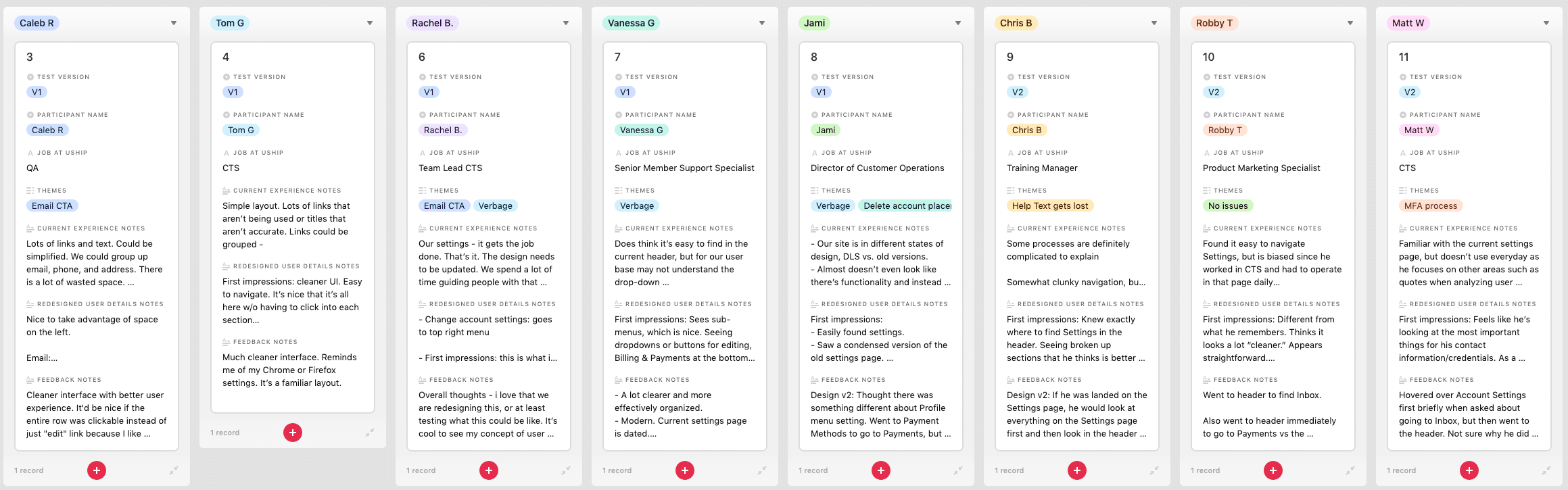
Through Airtables, I highlighted themes I was hearing:
Email CTA – the call to action was not clear
Verbage – users were unsure of what certain phrases meant, and I noticed their confusion
Help Text Lost – this meant they did not notice the helper text on the far right column
MFA process – refers to the uncertainty about the process itself
Iterative Research and Design (V2)
Based off these themes, I was able to iterate on my designs half-way through the sessions after the 4th participate.
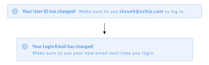
Change ‘Email Address’ to ‘Login Email’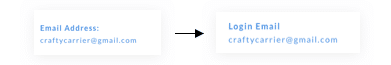
Change ‘Continue’ to ‘Send Verification’
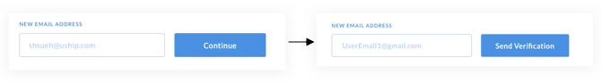
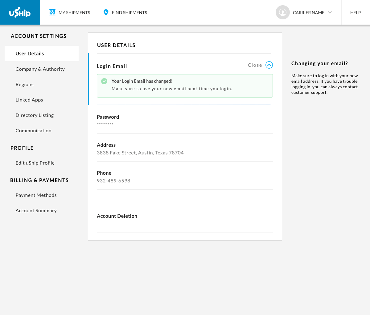
Reword the confirmation for clarity about logging in
After making these changes, users 5-8 successfully completed the tasks without issues.
Users also verbalized their thoughts during the tests:
“This would prevent so many calls to customer support about failed logins from email changes.”
“It’s about time we are doing 2-step verification for accounts. Trust & Safety will love this.”
“This is pretty straightforward and easy to do.”
“This looks so much better than before.”
To summarize my findings, I used Airtables to create a comparison of V1 and V2
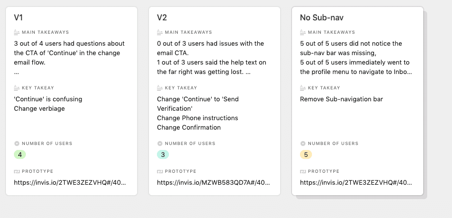
For V1 – 3 out of 4 users had questions about the CTA of ‘Continue’ in the ‘change email’ flow.
For V2 – 0 out of 3 users had issues with the email CTA when I changed it to “Send Verification”. 1 out of 3 users had issues seeing the help text.
Lastly, because of the new side-bar navigation, I wanted to remove the sub-header navigation. There were important links on that sub-header navigation, but they were duplicates of links in other areas. I removed this sub-header bar to see if users noticed a difference, and to see if the information architecture was negatively impacted. 5 out of 5 users did not notice a difference when I removed it, and they were able to navigate to the sub-links by going to other prominent areas. This validated the unimportance of the sub-header navigation bar, so I removed it for future designs.
For both versions, all users successfully completed the tasks and complimented the ease of use.
This design was a success, and I felt confident to move to high-fidelity designs using assets in our DLS.
Hi-fidelity Designs
(This design is not yet in production and will not be worked on until Q2-Q3 of 2020)